線條斷在半空,那是留白
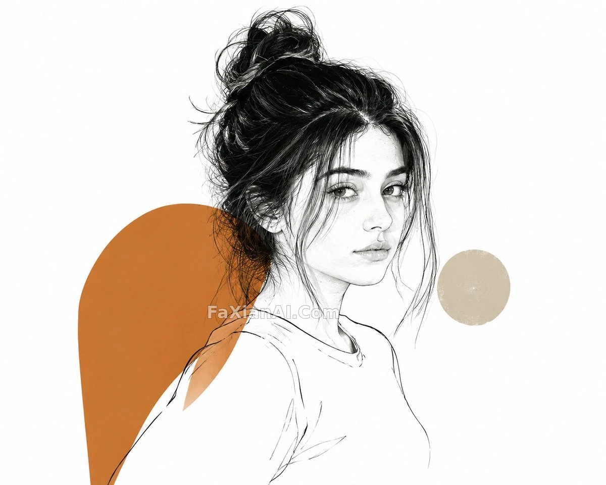
仙鶴只畫了一半,剩下的空白比線條還重要
✍️ 這張的問題不在畫得像不像仙鶴,在於線條什麼時候該斷——斷早了顯單薄,斷晚了留白就廢了,色塊只放一到兩塊是為了不跟留白搶視覺重量。
📋 提示詞 自然語言
An elegant editorial illustration built around [subject: a crane in mid-flight], combining a delicate contour line with just one or two bold solid-color shapes dropped in for weight. Certain areas are left intentionally unfinished, the line simply trailing off, so the balance between drawn detail and empty space stays deliberate rather than accidental. Set against a plain white background, the whole piece reads with a contemporary art-magazine sensibility.
📋 中文譯寫版 自然語言
一幅圍繞[主體:振翅中的仙鶴]展開的優雅編輯向插畫,用纖細的輪廓線條搭配一到兩塊大膽的純色色塊壓住分量。部分割槽域故意留白未完成,線條走到一半就斷掉,讓畫面細節與空白之間的平衡顯得是刻意為之而非隨意留下的。背景是純白,整體調性偏當代藝術雜誌那一路。