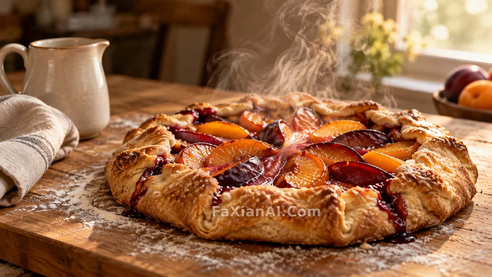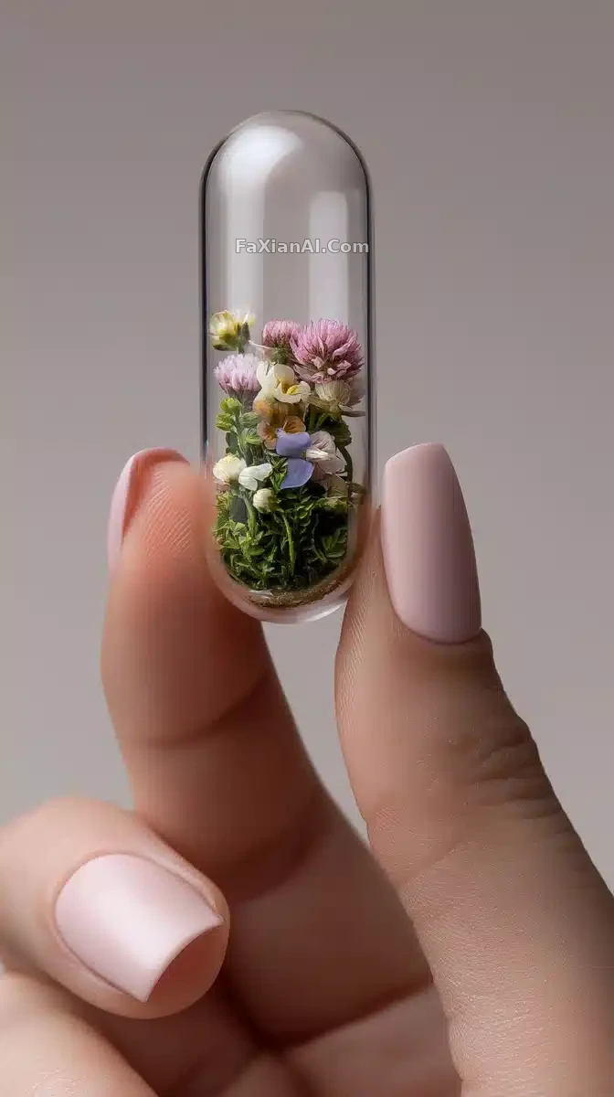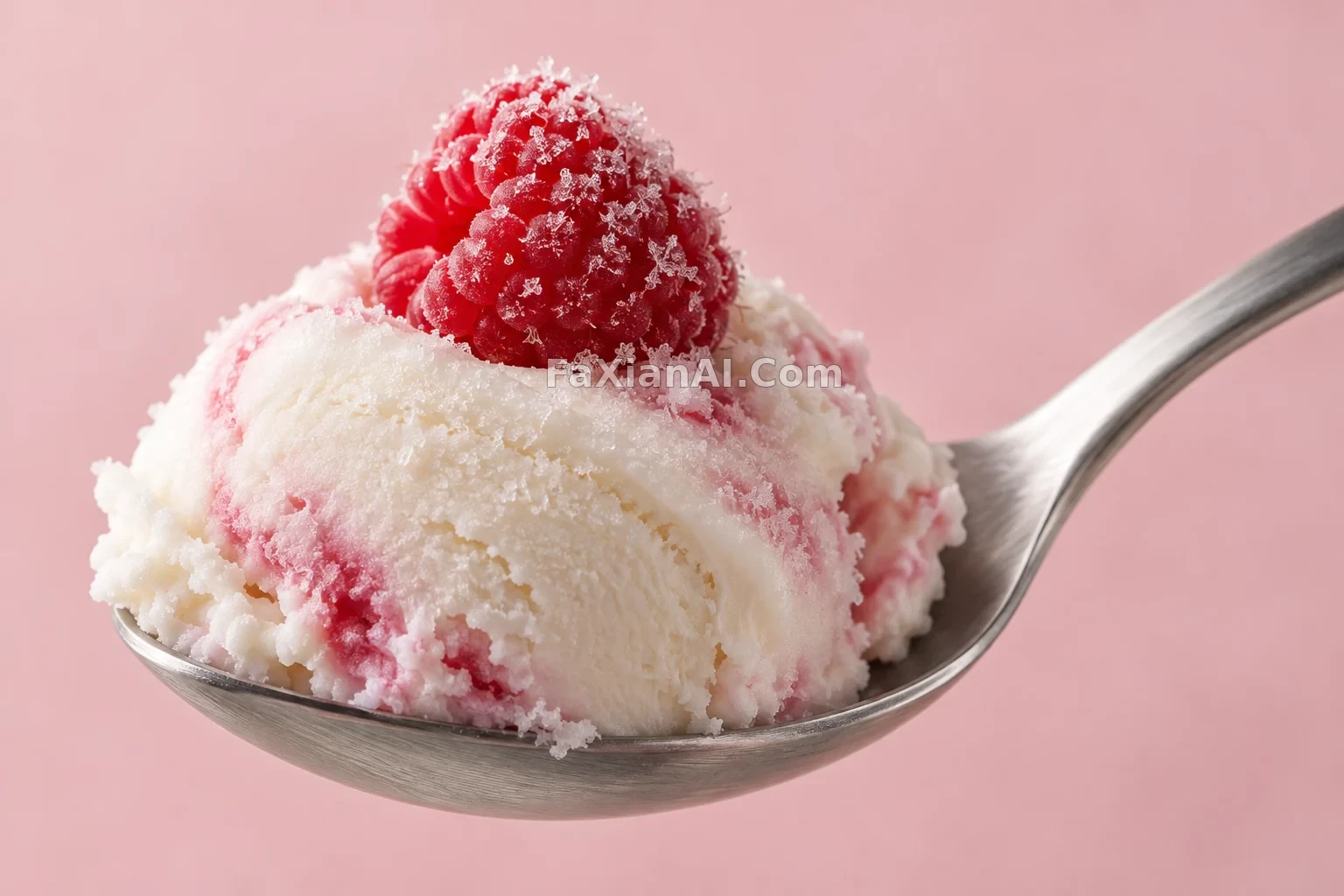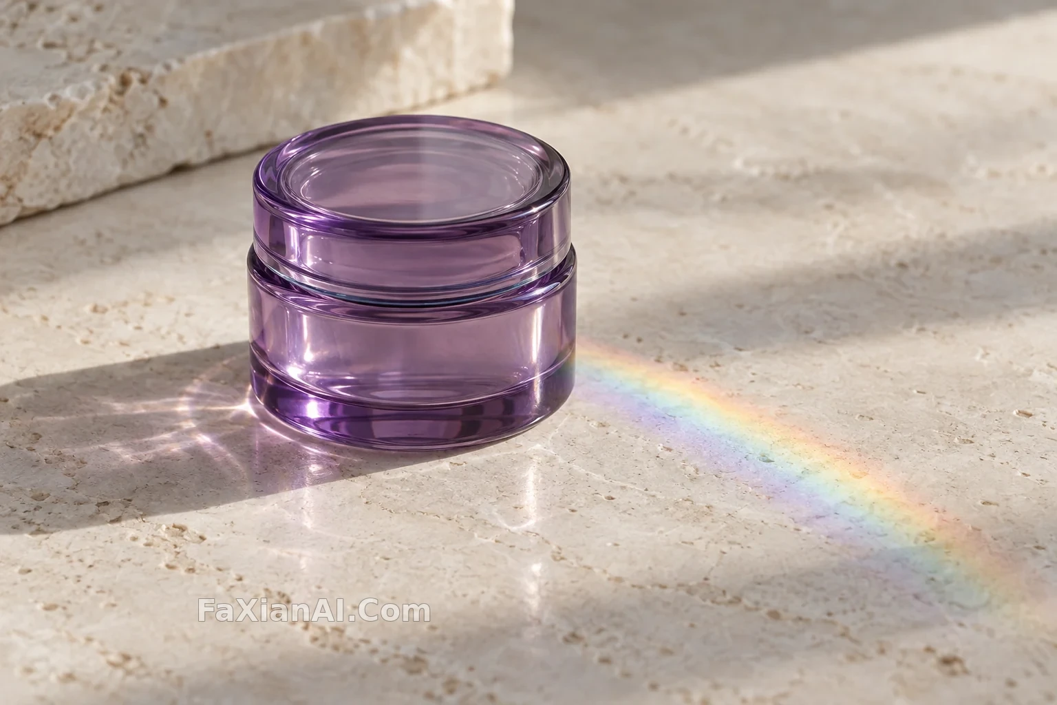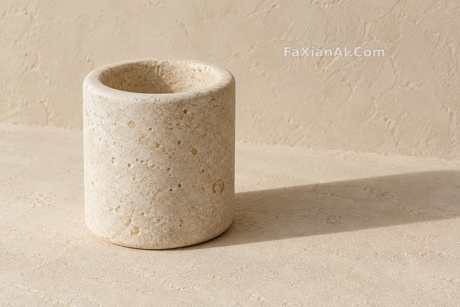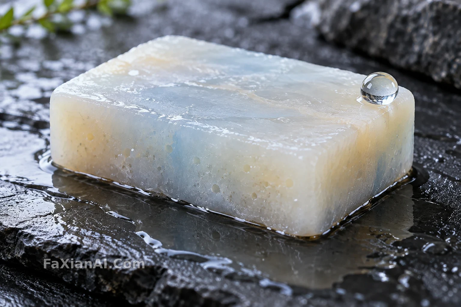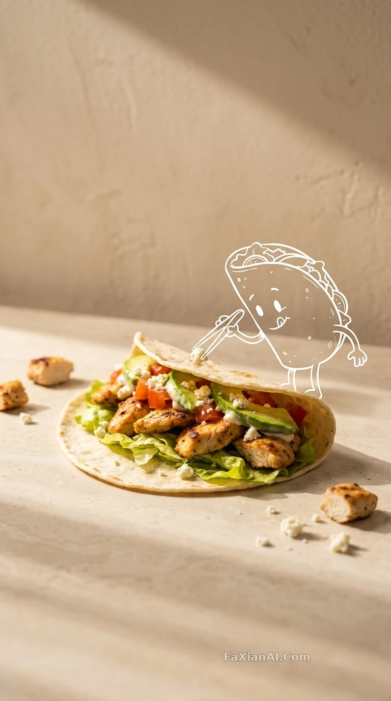
白線塗鴉疊加的極簡產品照
塗鴉跟產品互動得剛剛好,商業感和手繪感一樣都沒丟。
✍️ 白線塗鴉這步得拿捏鬆緊,畫太規整就成插畫海報,畫太隨意就散架,得像順手在產品邊上補了一筆。淺景深負責把兩層媒介焐成一體。
📋 提示詞 自然語言618 字元
An ultra-realistic minimalist product photo built from the reference image: a clean, warm studio setup with a textured beige wall behind it, soft directional sunlight casting long shadows across a simple tabletop surface. The product itself sits in a playful, concept-driven arrangement. Layered on top is a hand-drawn white line doodle of [the main character from the reference image], sketched as if interacting with the product — the doodle style should read like mixed media, blending real photography with loose sketch illustration for a premium branding feel. Shallow depth of field, no extra text, no watermark.
📋 中文譯寫版 自然語言
基於參考圖做一張超寫實的極簡產品照:乾淨溫暖的影棚場景,背景是有紋理的米色牆面,柔和的定向陽光在簡單桌面上拉出長長的陰影。產品本身按一種俏皮的概念構圖擺放。畫面上疊加一層手繪白色線條塗鴉,畫的是[參考圖中的主角]正在和產品互動,這層塗鴉要有混合媒體的味道——把真實攝影和鬆弛的手繪插畫感揉在一起,整體呈現高階品牌質感。淺景深,超寫實,不要多餘文字,不要水印。