Home › E-commerce › Minimalist Product Shot with White Line Doodle Overlay
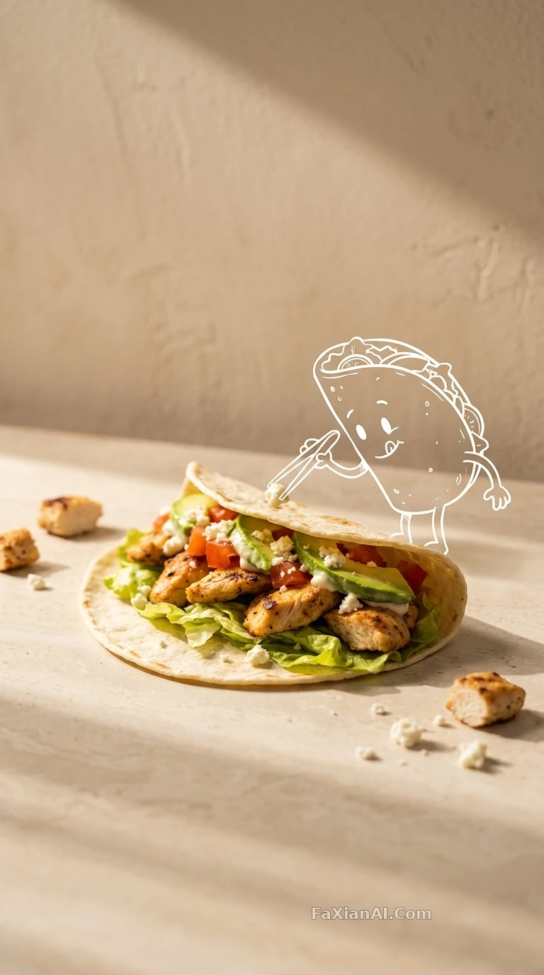
Minimalist Product Shot with White Line Doodle Overlay
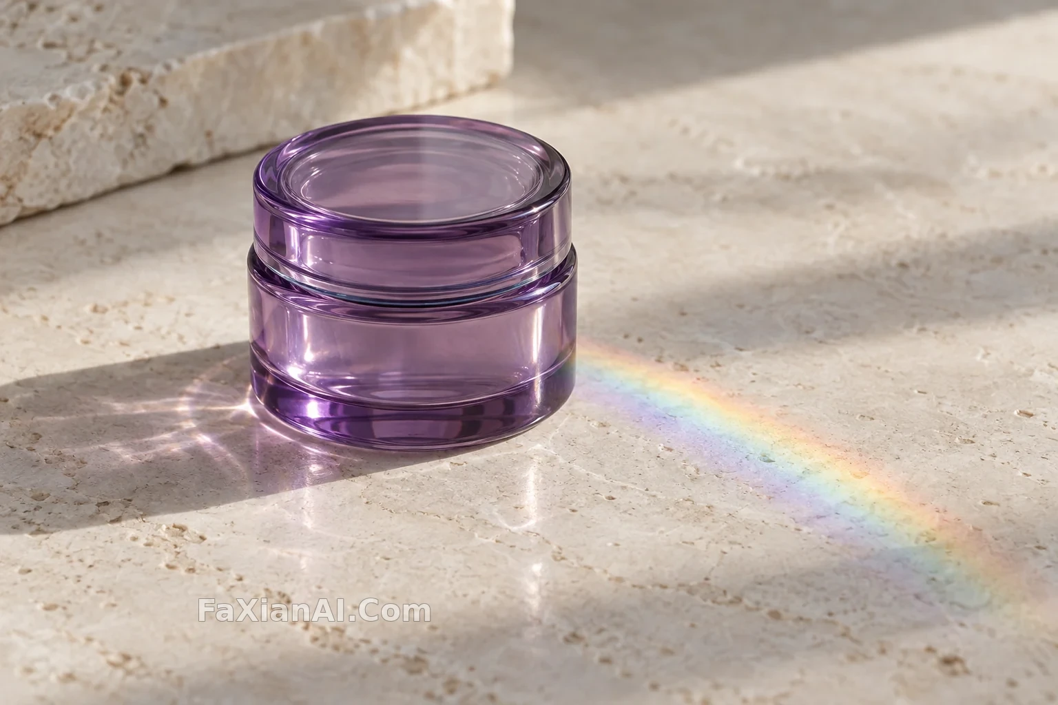
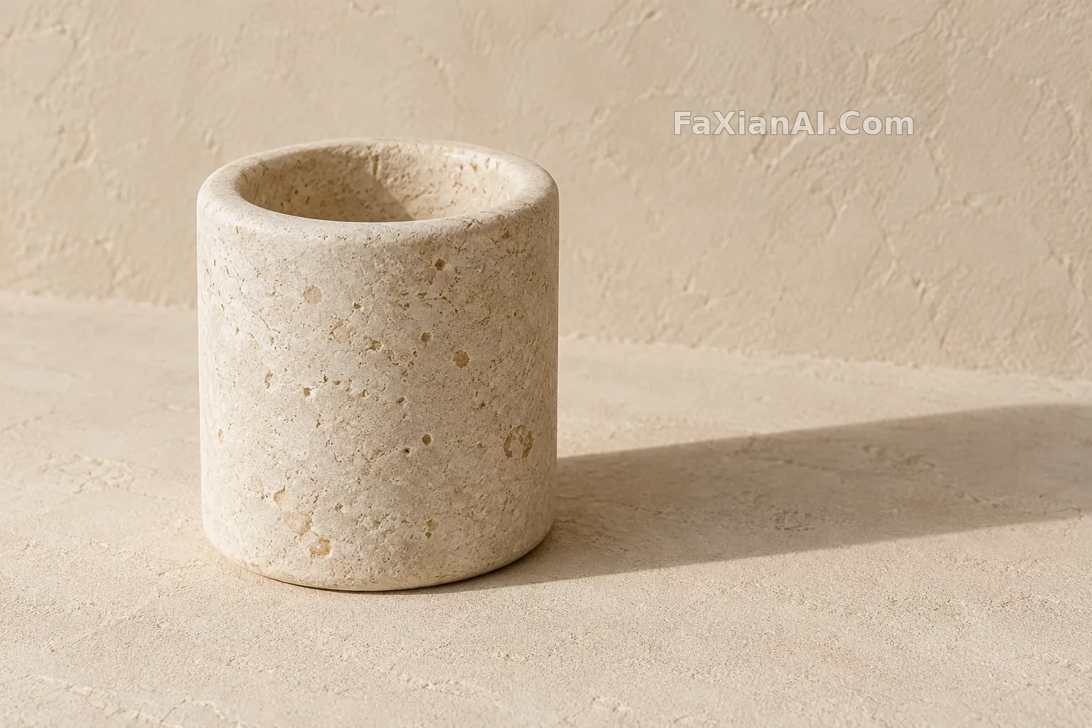
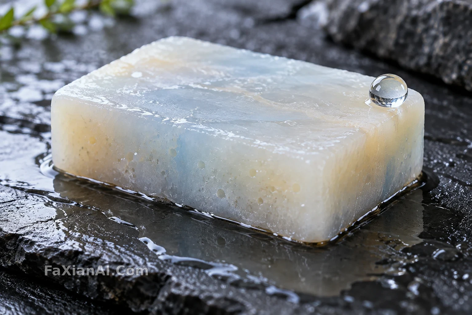
The doodle interacts with the product just right — commercial polish and hand-drawn charm both survive intact.
✍️ Getting the white-line doodle right is a balancing act — too tidy and it turns into an illustrated poster, too loose and it falls apart; it should read like a casual mark dashed off beside the product. Shallow depth of field is what fuses the two media into one.
📋 Prompt Natural Language618 characters
An ultra-realistic minimalist product photo built from the reference image: a clean, warm studio setup with a textured beige wall behind it, soft directional sunlight casting long shadows across a simple tabletop surface. The product itself sits in a playful, concept-driven arrangement. Layered on top is a hand-drawn white line doodle of [the main character from the reference image], sketched as if interacting with the product — the doodle style should read like mixed media, blending real photography with loose sketch illustration for a premium branding feel. Shallow depth of field, no extra text, no watermark.