手繪小人敢伸手摸真實產品
一支筆畫出來的角色,毫不客氣地闖進真照片裡,廣告不正經反而被記住
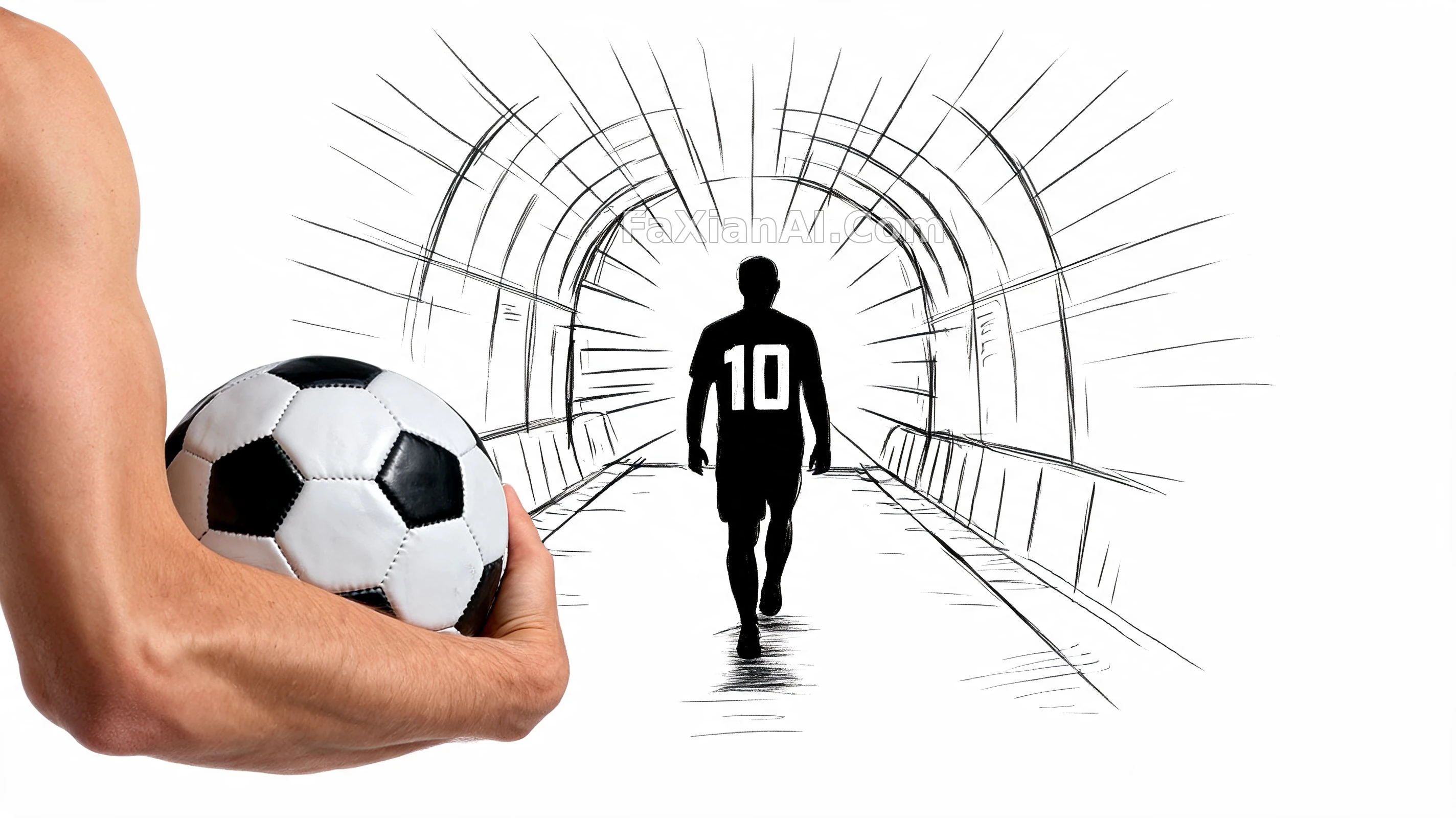
✍️ 兩個世界撞在一起才好記,線稿簡筆畫的手伸進一張真實產品照片裡,手繪越潦草,產品的寫實感越被襯出來,廣告最怕的就是太規矩。
📋 提示詞 自然語言915 字元
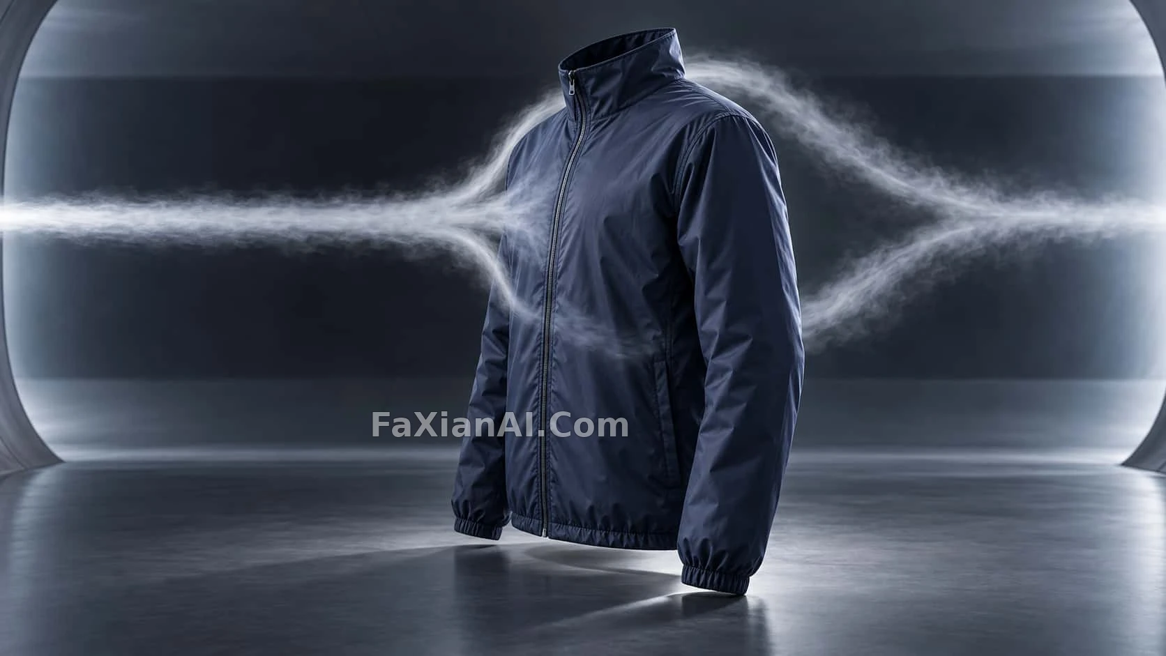
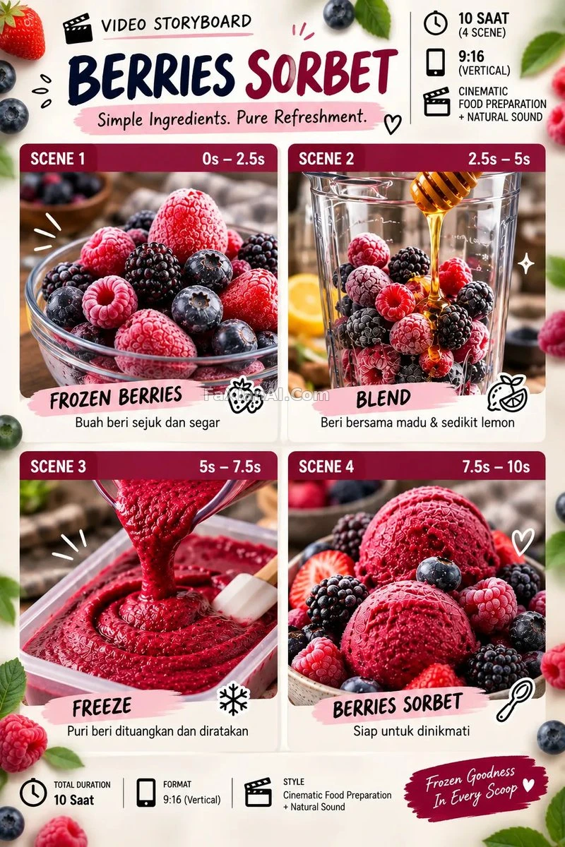
A hand-drawn black ink cartoon character reaches into the real world: [SCENE], interacting naturally with a genuine photograph of a [BRAND PRODUCT] as if the product truly belongs inside the character's own world. The drawing itself stays simple — expressive line art with minimal shading, like a fast sketch tossed off on paper — while the product keeps full photographic realism, the two seamlessly composited together.
Layout: 16:9 horizontal frame, clean white studio background, studio lighting, sharp focus throughout. At the top, the [BRAND] slogan set in clean bold sans-serif type. At the bottom, the real brand logo rendered at its original colors and proportions.
Finish: photorealistic product merged with bold black doodle art, a perfectly seamless blend between drawn and real elements, witty scroll-stopping ad energy, high contrast, minimalist composition, trending creative-advertising aesthetic.
📋 中文譯寫版 自然語言
一個黑色墨線手繪卡通角色伸手闖進現實:{SCENE},自然地和一張真實的 [BRAND PRODUCT] 產品照片互動,彷彿這個產品本來就活在角色的世界裡。手繪部分保持簡單——表現力十足的線稿,幾乎不加陰影,像隨手在紙上畫的速寫——而產品本身保留完整的攝影質感,兩者無縫合成在一起。
版式:16:9 橫幅,乾淨的白色影棚背景,棚拍打光,全程銳利對焦。頂部放 [BRAND] 的slogan,用乾淨粗體無襯線字型。底部放真實品牌logo,保持原始顏色和比例。
成片質感:寫實產品與粗黑塗鴉藝術融合,手繪與實拍無縫銜接,機智又抓眼球的廣告能量,高對比度,極簡構圖,當下流行的創意廣告美學。