橘與苔色的文具材質練習
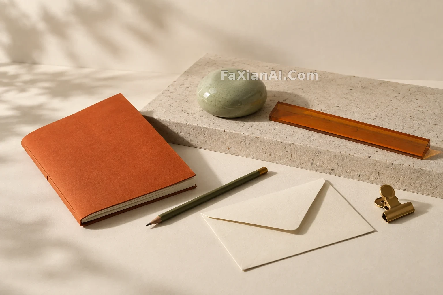
這組文具沒有靠誇張造型取勝,靠的是紙、釉、樹脂與金屬在同一束窗光裡的不同反應。
✍️ 文具套裝可以先從材質關係開始,而不是先找一個噱頭。啞光紙面、半透明樹脂、陶瓷釉和黃銅夾在同一色溫下的反射差異,足夠讓極簡畫面站住。
📋 提示词 自然语言
Create a standalone editorial product still life of six unbranded stationery objects: a folded persimmon-orange notebook, a pale green ceramic paperweight, a translucent amber ruler with no markings, an olive pencil, a cream envelope, and a small brass clip. Arrange them diagonally on a recycled-paper plinth against a warm off-white studio sweep. Soft side window light, restrained autumn palette, sharp tactile materials and ample negative space. No food, people, readable text, numbers, logos, watermarks, collage, border, or UI.
📋 中文译写版 自然语言
生成一張獨立的編輯感產品靜物:六件無品牌文具,包括一本柿子橘色摺頁筆記本、一枚淺綠色陶瓷鎮紙、一把沒有刻度的半透明琥珀色尺子、一支橄欖綠鉛筆、一個奶油色信封和一枚小黃銅夾。將它們沿對角線擺在再生紙質底座上,背景是溫暖的米白影棚。柔和側窗光、剋制的秋日配色、清晰可觸的材質與充分留白。不要食物、人物、可讀文字、數字、商標、水印、拼貼、邊框或介面。