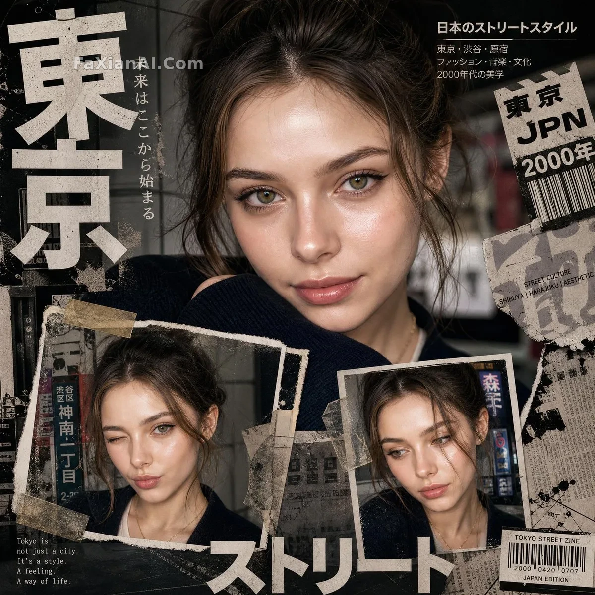
撕纸拼贴,杂志感特写唇妆
哑光唇釉配撕纸质感刚刚好,色调压中性,一掺粉就垮成少女漫画感了。
✍️ no pink aesthetic这条负面约束才是真正把控质感的地方——少了它,撕纸拼贴很容易滑向可爱风。哑光唇加中性色温才是让它读成编辑感而不是少女向的关键。
📋 提示词 自然语言1141 字符
A bold [aesthetic: Y2K Japanese street-editorial collage poster] built on a clean high-fashion magazine aesthetic — gritty paper textures, torn magazine cutouts, distressed ink splashes, and an urban [city style: Tokyo-inspired] design language. At the top, [portrait style: one large cinematic close-up portrait] commands the composition: intense eye focus, natural skin texture, glossy lips, messy tied-up hair, no glasses, soft dramatic lighting, a confident yet innocent expression rendered in ultra-realistic fashion-photography style. Below it, exactly 2 smaller portrait collage frames show different expressions and angles, taped on like ripped polaroids. Layer in oversized bold Japanese typography, minimal English text, subtle Japanese street signs, barcode stickers, newspaper scraps, vintage grunge textures, paint strokes, film grain, and tape pieces for a premium editorial magazine layout — edgy yet clean, a modern Japanese fashion zine with cinematic shadows, sharp eye detail, RAW DSLR realism, an editorial streetwear moodboard. Ultra detailed, 8K, balanced neutral tones — no pink aesthetic, no bubbles, no cartoon vibe.