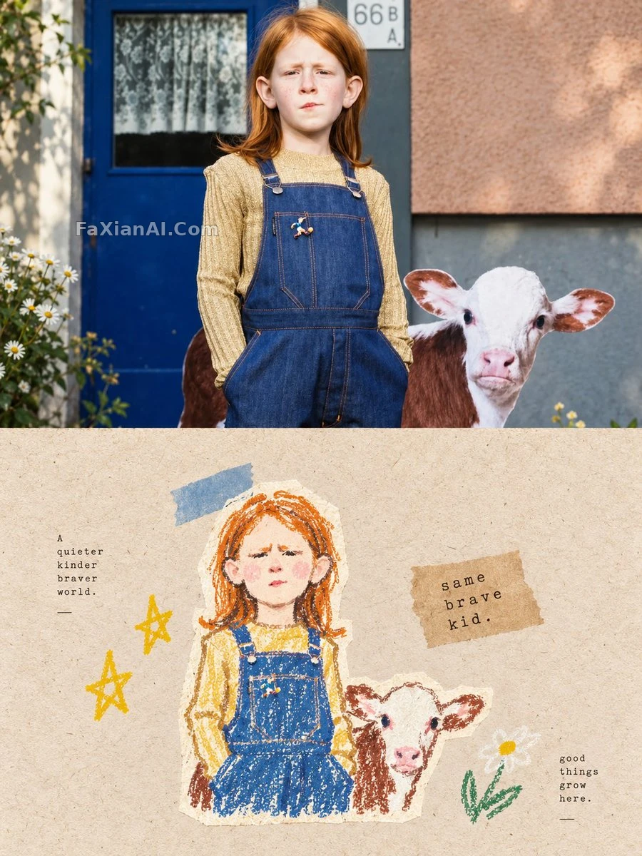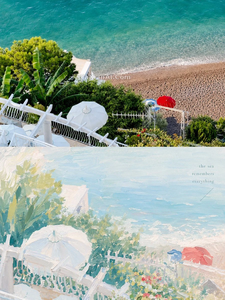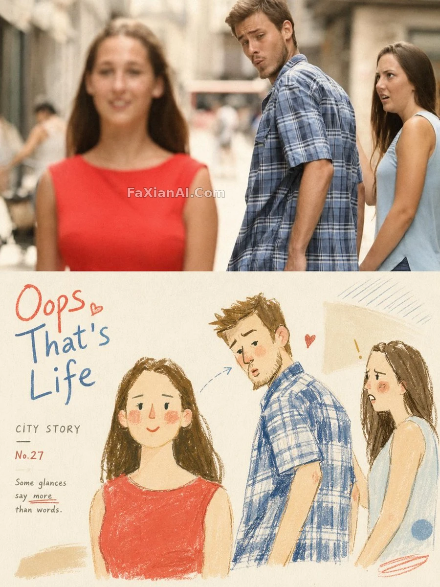
照片配手绘插画,上半写实下半童趣
上半截是修过色的实拍照,下半截切成包豪斯撞儿童绘本的手绘小画。
✍️ 字体这块是真正的技术活——手写体要克制,笔画粗细不能跟插画线条打架,否则下半张的童趣感全被文字盖过去。留白比例卡住了,上下两半才不会显得挤。
📋 提示词 自然语言776 字符
Turn each uploaded photo into a 3:4 poster split cleanly in two. Top half: the original photo, graded like an editorial shoot. Bottom half: a naive, lighthearted, vintage hand-drawn illustration that riffs on the photo above it. Blend Bauhaus composition with a children's-book feel and loose fashion-sketch linework -- simplify the shapes and exaggerate proportions just slightly, enough to read as funny. Keep the palette high-brightness, low-saturation pastel, built from watercolor, pencil, and crayon textures, with generous white space and deliberately 'imperfect' printed edges. Letter it in a vintage hand-written style, using restrained fonts that sit quietly inside the illustration rather than shouting over it. The whole vibe: playful, chic, and a little romantic.
📋 中文译写版 自然语言
把每张上传的照片做成一张3:4的海报,上下一分为二。上半部分:原图配杂志级修色。下半部分:一幅天真烂漫、带点复古感的手绘插画,呼应上方的照片。风格融合包豪斯构图、儿童绘本气质和松散的时装速写线条——形状简化,比例略微夸张到刚好有点好笑的程度。色调走高亮度低饱和的马卡龙系,用水彩、铅笔、蜡笔质感堆出来,大面积留白,边缘故意做出印刷不完美的毛边感。字体走复古手写风,克制不张扬,安静地融进插画里而不是抢戏。整体气质:俏皮、时髦,带点浪漫。