给刊物气质换上撞色卡通壳
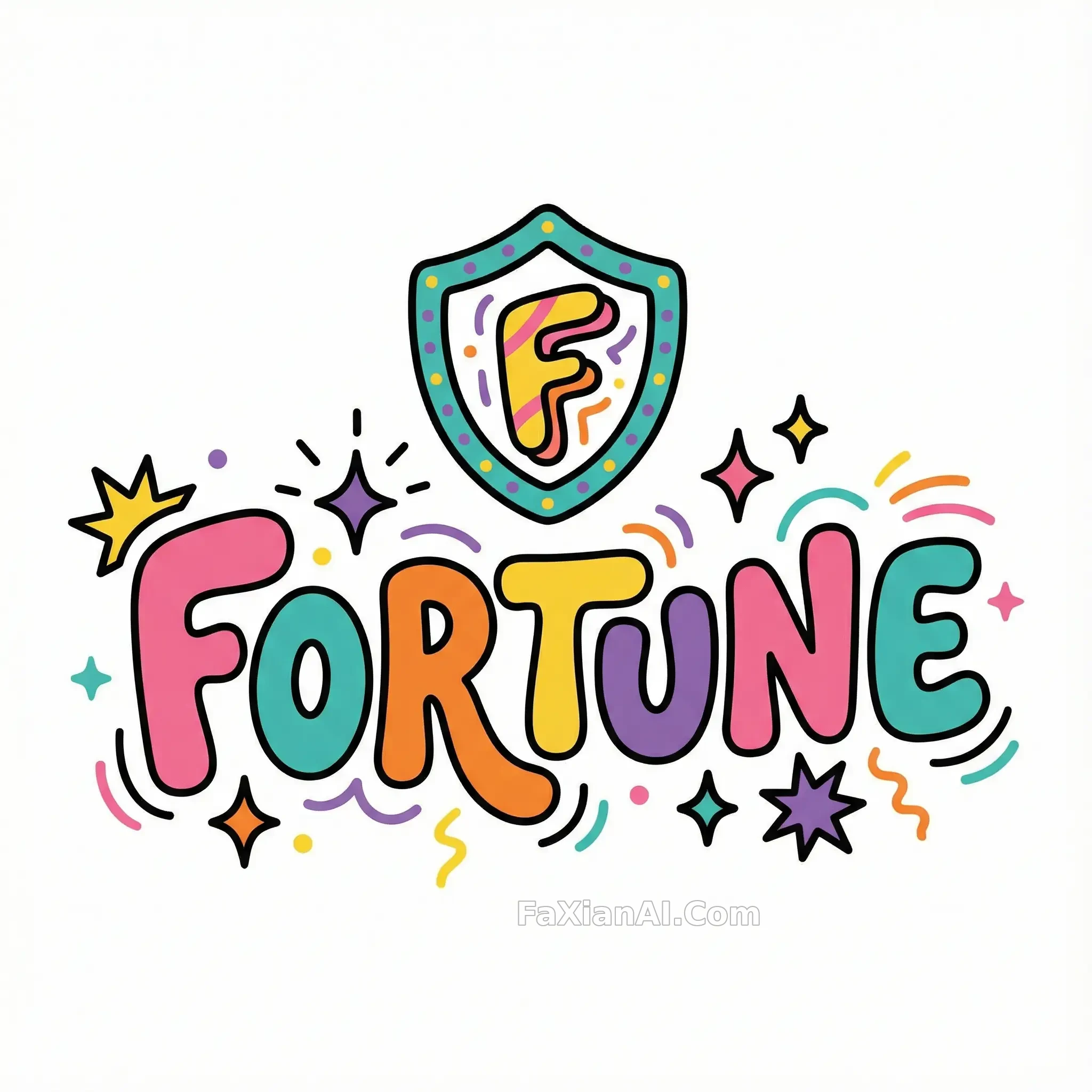
粗黑线一勾,严肃感秒变泡泡糖,商标结构照样立得住。
✍️ 这条的成败全在轮廓线粗细和留白比例上,粗一分就蠢萌,细一分就廉价,调这个平衡比选色费劲得多,换个品牌照这个思路套照样能立住。
📋 提示词 自然语言747 字符
Reimagine a bold magazine-style wordmark as a playful 2D cartoon icon with thick black contour lines wrapping every shape. Push the palette toward loud, flat, unmixed color — pink, teal, orange, yellow, purple — laid down in confident solid fields rather than gradients. Let each letterform balloon out slightly, rounding every corner into a bubbly, exaggerated silhouette, and scatter in a few playful accents where they fit naturally: a burst of stars, a run of stripes, a spark or two. Keep the overall drawing simple and stylized, closer to a hand-inked sticker than a polished vector illustration, though the linework should still be clean enough to trace as vector art. Isolate everything on a plain white ground, framed in a perfect square.
📋 中文译写版 自然语言
把一个杂志式的粗体商标重新画成好玩的2D卡通图标,每个形状外面都裹一圈粗黑轮廓线。配色往夸张扁平走——粉、青、橙、黄、紫,用大面积纯色平铺而不是渐变。让字形微微鼓起来,四个角都收成圆润夸张的轮廓,再见缝插针加几个俏皮点缀:一簇星芒、几道条纹、一两处火花。整体画法保持简单和风格化,更像手绘贴纸而不是精修矢量插画,但线条依旧要干净到能直接描成矢量图。背景留白,构图为正方形。