Home › Design Assets › Wrapping a Magazine Wordmark in a Cartoon Shell
Wrapping a Magazine Wordmark in a Cartoon Shell
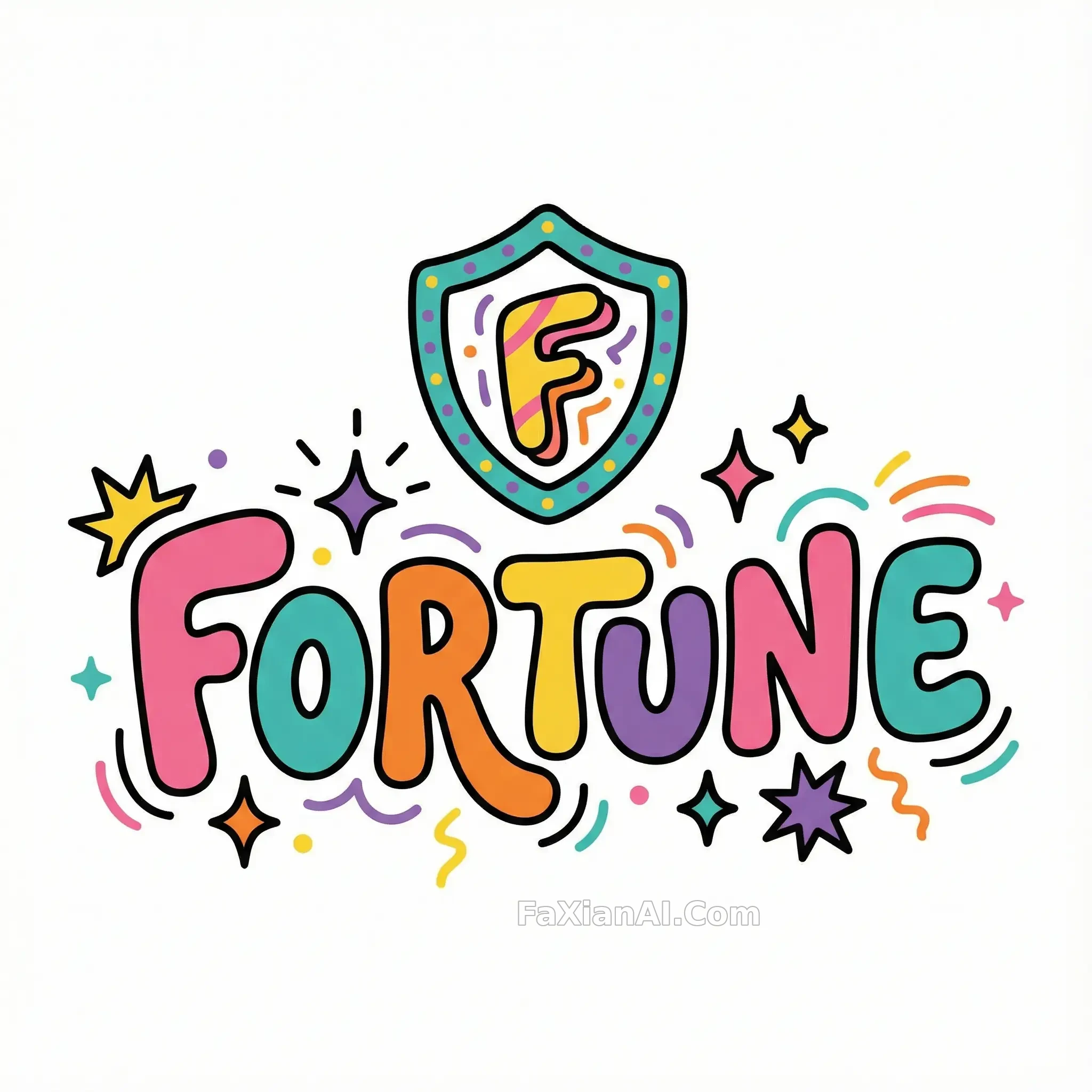
One thick black outline and the serious tone turns to bubblegum — the wordmark's structure still holds.
✍️ This one lives or dies on outline weight and spacing — go a touch thicker and it turns goofy-cute, a touch thinner and it looks cheap. Dialing in that balance takes far more work than picking colors, but the same approach carries over to any other brand.
📋 Prompt Natural Language747 characters
Reimagine a bold magazine-style wordmark as a playful 2D cartoon icon with thick black contour lines wrapping every shape. Push the palette toward loud, flat, unmixed color — pink, teal, orange, yellow, purple — laid down in confident solid fields rather than gradients. Let each letterform balloon out slightly, rounding every corner into a bubbly, exaggerated silhouette, and scatter in a few playful accents where they fit naturally: a burst of stars, a run of stripes, a spark or two. Keep the overall drawing simple and stylized, closer to a hand-inked sticker than a polished vector illustration, though the linework should still be clean enough to trace as vector art. Isolate everything on a plain white ground, framed in a perfect square.