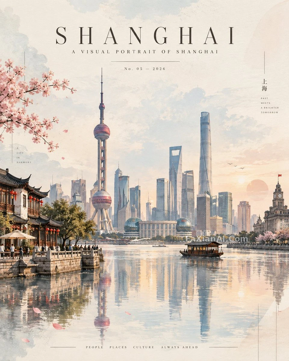

宣紙の地色に水墨風、スライドのレイアウト
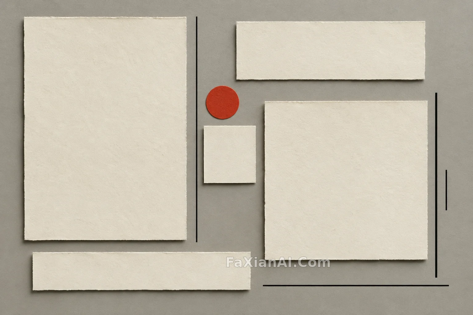
余白をたっぷり取った水墨調のプレゼン一枚。タイトル、要点、印章がそれぞれ一角を占める。
✍️ プロンプト全体でいちばん価値があるのは、最後の連続性の段落。二つの色値と印章の位置を書き切っておくから、複数ページになっても生成するほど散らばらない。余白の取り方も変数に任せてあるので、業種を替えるときは括弧の中だけ直せばいい。
📋 プロンプト 番号区切り式876文字
以下のブリーフに沿って、水墨画スタイルのプレゼン資料の一枚をデザインしてください。
雰囲気:ページ全体を[visual style: Quiet / Restrained / Wabi-Sabi / Contemporary East-Asian Luxury]に保つ。
ビジュアル層:[Describe visual elements, e.g., Textured rice paper background, Ink-wash motifs, Enso circle, Red seal mark, Mist-grey effects]。
レイアウト:[Layout description, e.g., Split layout, Centered layout, Left-aligned text with negative space]。
タイポグラフィ:[Text hierarchy, e.g., Large Display Serif for the title, Body Serif for body copy, keeping visual balance and a clear reading order]。
スライドに入れる文字:
見出し - [Title: Enter slide title here]
1. [Point 1: Concise description]
2. [Point 2: Core data or facts]
3. [Point 3: Key conclusions]
シリーズの一貫性:[Continuity description, e.g., carry over the background texture and color tone (#F5F0E8, #2C3E2D) from the previous page, and set the seal in a similar spot so the slides read as one set]。