Home › Illustration › Watercolor Street Poster with Journal-Page Margins
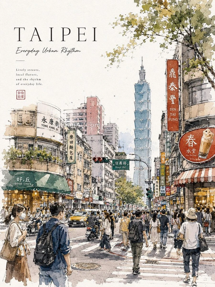
Watercolor Street Poster with Journal-Page Margins
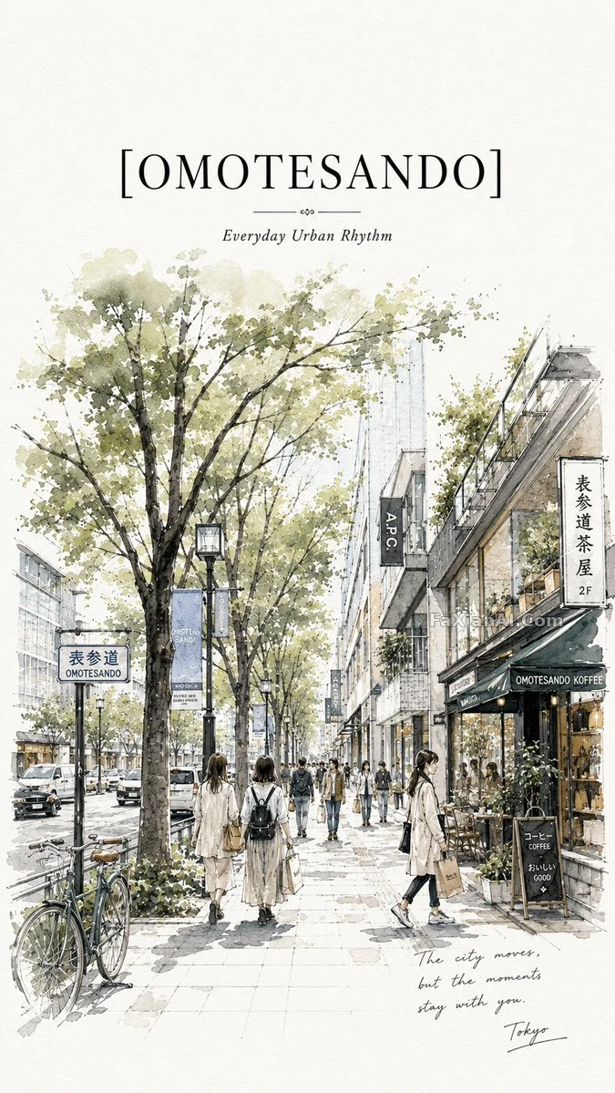
My daughter looked at it and said it was like a street from a picture book, cafes and passersby all bleeding softly in watercolor.
✍️ Swap the city name and the street scene and the whole poster becomes another city. Even our kid can tell them apart. The big headline with a handwritten subtitle holds the layout up, and the white margin stays so it feels like a page pasted into a journal. Without it, it's just an ordinary watercolor.
📋 Prompt Natural Language762 characters
Premium editorial tourism poster with a white-margin layout and a travel-journal feel. At the top left, set the large title [city name: stylish city name] as bold lettering, with a handwritten-script subtitle beneath it. Below the title, paint [city street: lively city street] as a hand-painted urban sketch in watercolor: soft ink outlines, loose brush strokes, watercolor splashes and crisp architectural detail. Fashionable pedestrians stroll along a busy avenue past cozy cafés and local shops, drawn with cinematic perspective, warm natural lighting and atmospheric depth, so everyday city life looks real. Palette: [color palette: pastel earth tones]. Add a subtle paper texture, keep it highly detailed, with a European/Japanese street illustration vibe.