
GPT Images 2 + PixPix: 5 Cases That Turn Generation Into a Full E-Commerce Delivery Workflow
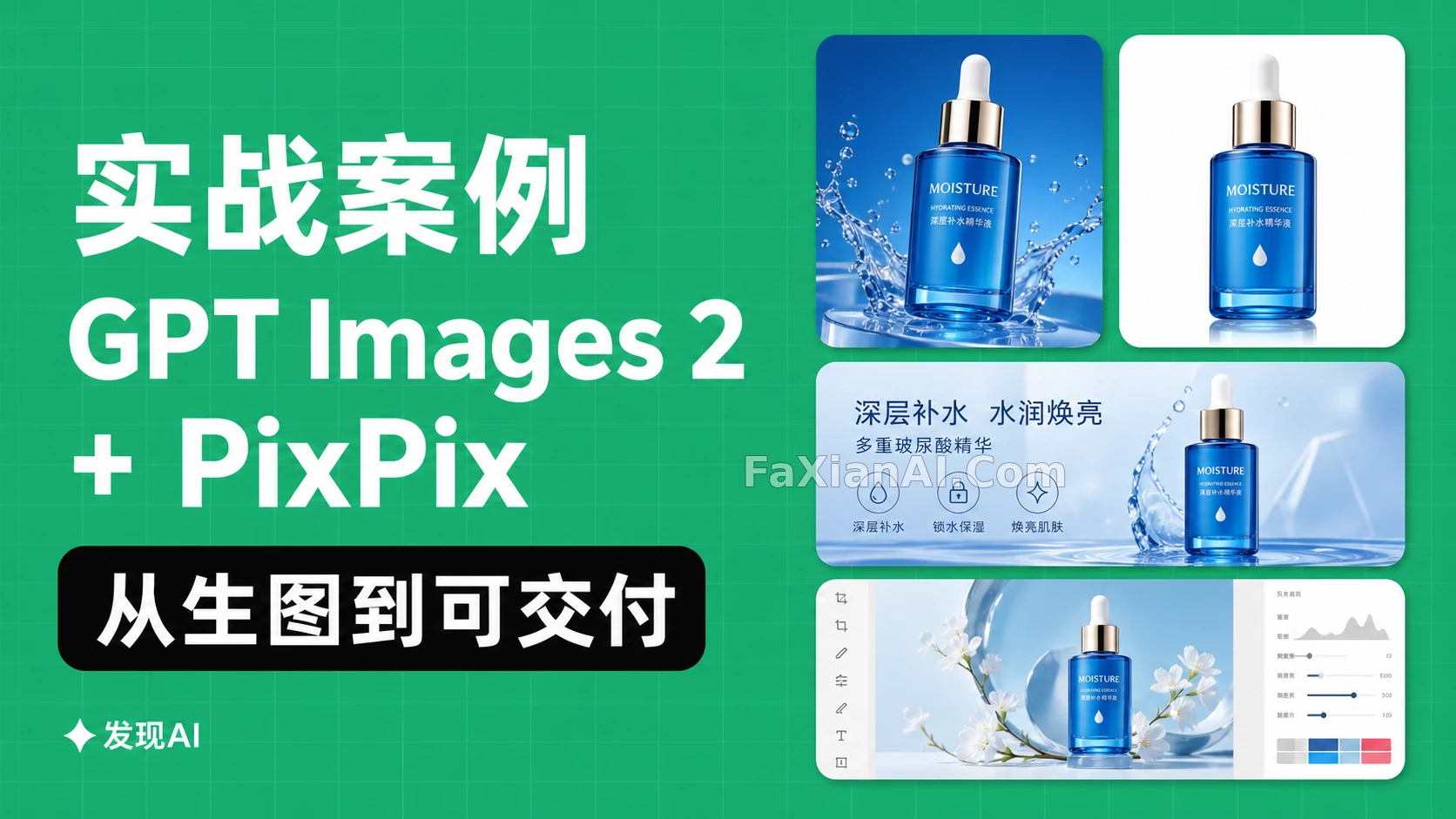
Getting one image generated stopped being the hard part of AI image tools a while ago. What actually eats up time is the second half: the product color can't drift, the white-background shot and the banner need to come from the same visual system, the detail page needs close-up crops, and the social post still needs to leave room for copy. If you try to solve that by just "generating another one," you usually end up with a pile of images that each look fine on their own but can't be used together.
This piece treats GPT Images 2 + PixPix as a production line: GPT Images 2 locks in the direction, product mood, and composition first; PixPix then stretches that master shot into different formats and uses local edits to keep flaws contained. Every example image below is an original illustration made with FaxianAI's image generation tools — feel free to copy the prompts and checkpoints and swap in your own product details.
1. See the whole pipeline first: one master shot, not a one-off final
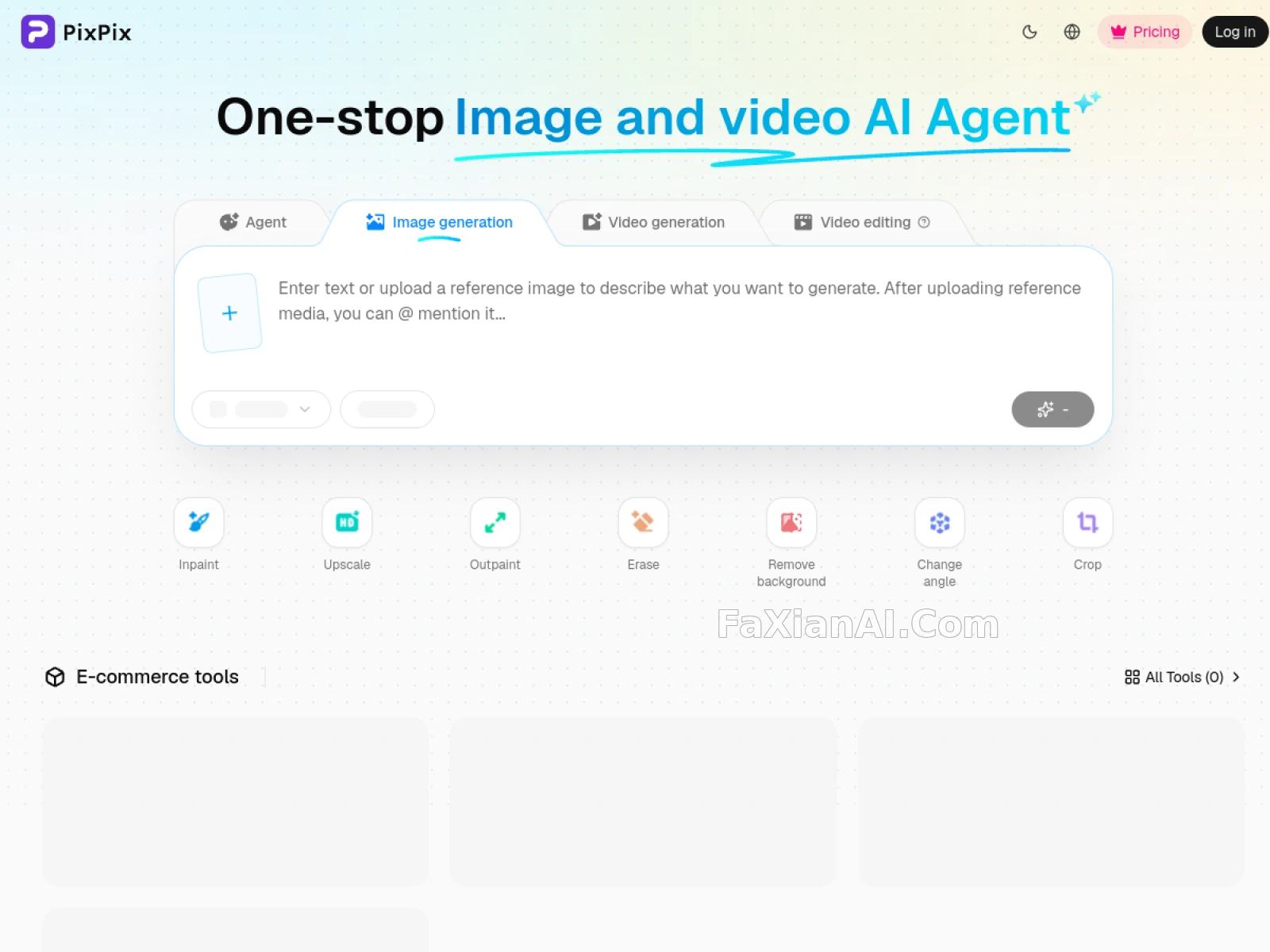
PixPix's public workbench puts GPT Image 2 generation together with Inpaint, Upscale, Outpaint, Erase, Remove background, Change angle, and Crop on a single toolchain. It helps to split the job into four layers: pin down the product facts first, generate a master shot with the right direction, use local tools to fix sizing and small issues, then crop and export for each channel.
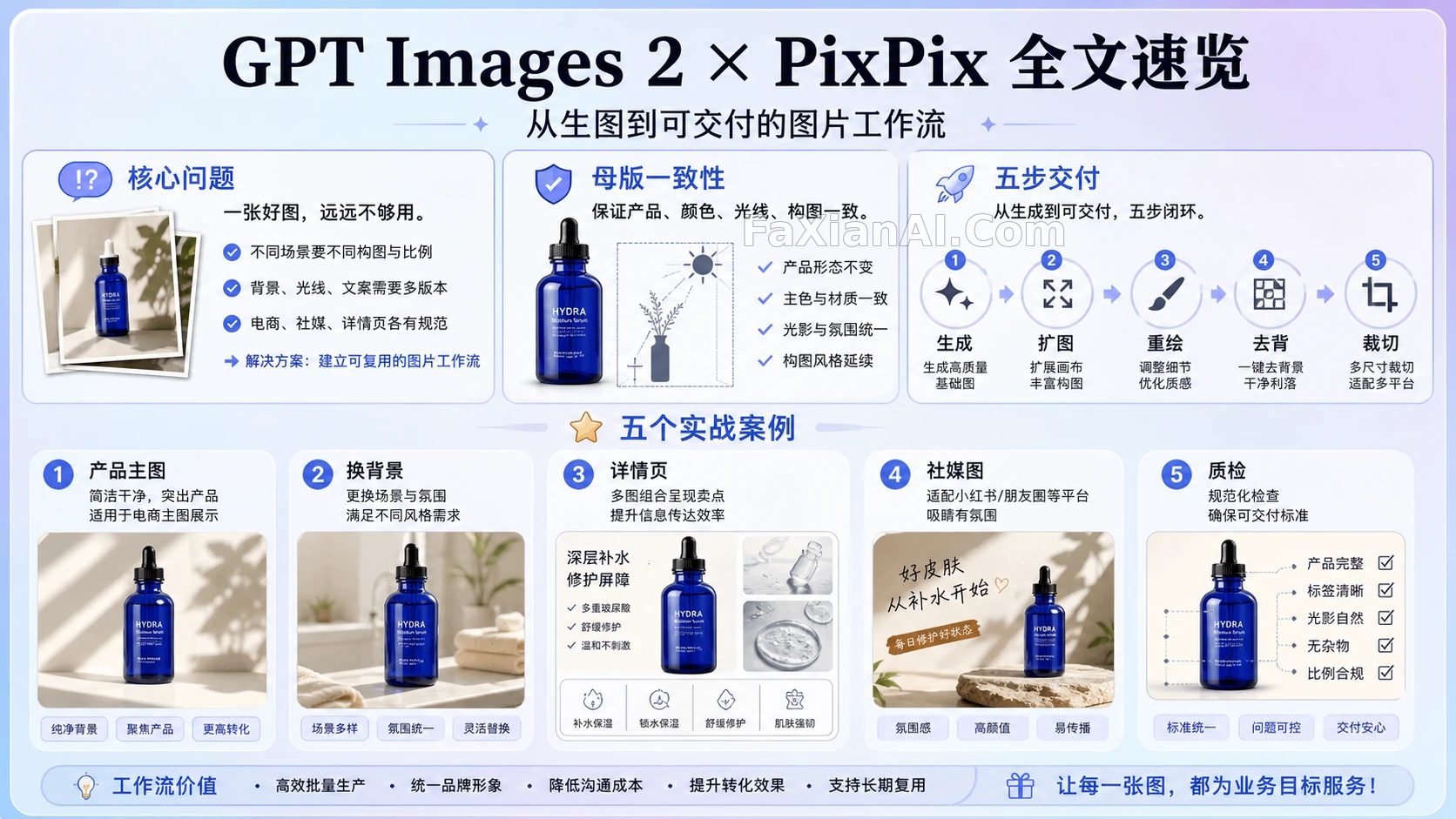
Use the image above to figure out which step you're missing before you open the tool and start working — it's a map of the workflow, not a second cover image. When you're actually doing the work, generation, outpainting, local repainting, and delivery formats should all happen back-to-back in the same task.
A master shot only passes on four checks: the subject's proportions haven't shifted, the material reads correctly, the light direction is consistent, and there's usable negative space on at least one side. If any one of these fails, go back to generation — don't try to patch it with local edits.
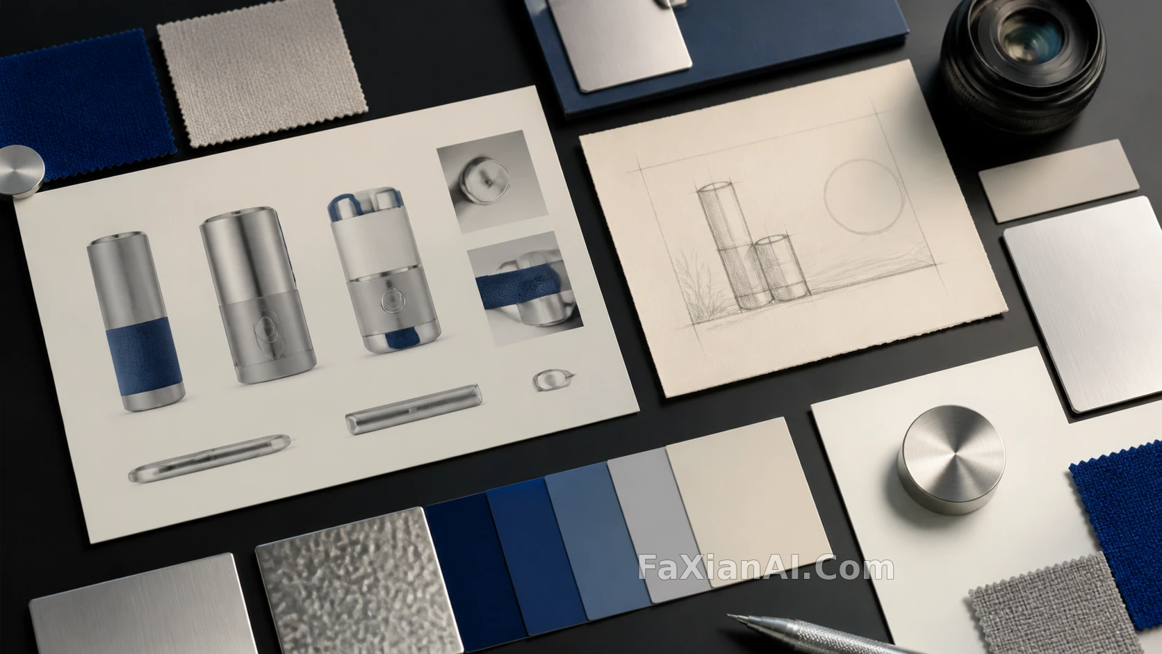
This step looks slow, but it's actually cutting down on every round of rework that comes after. Lock in the reference image, the structure that can't change, the primary material, and the channel aspect ratios up front, and every version after that has a shared basis for judgment.
2. Case 1: One product master shot, split into hero, white-background, and banner
Say you have a deep-blue glass serum bottle. The goal isn't "make one premium-looking poster" — you need a 4:5 hero shot, a 1:1 product card, a 16:9 banner, and a transparent-background asset, all at once. Start with the master shot only, and spell out what can't change: bottle proportions, cap structure, primary color, the main color block on the label, light direction.
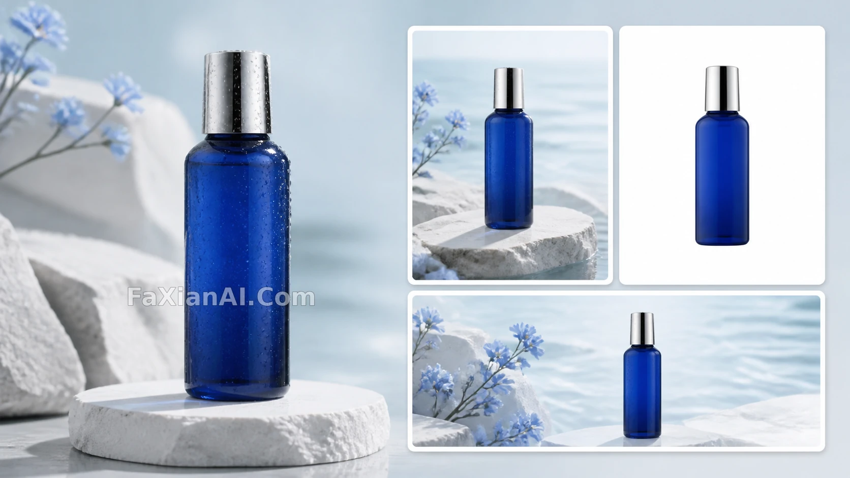
- Master shot prompt: "Reference product as the sole subject, keep the deep blue glass bottle's proportions, silver cap, and the label's main color block. Seamless white studio backdrop, soft key light from the left, realistic contact shadow, product positioned on the right side of the frame with clean copy space on the left, 4:5. No extra props, no text, no logo."
- Banner prompt: "Keep the product's position, proportions, label, lighting, and shadow unchanged; extend the canvas leftward to 16:9, continuing the white studio background and the fine stone countertop texture — the new area is for negative space only."
Pick the most convincing result from GPT Images 2 first, then use PixPix's Outpaint to extend the canvas horizontally. Save the white-background asset for last and handle it with Remove Background. This order keeps the cutout edges from getting damaged again during a later outpaint.
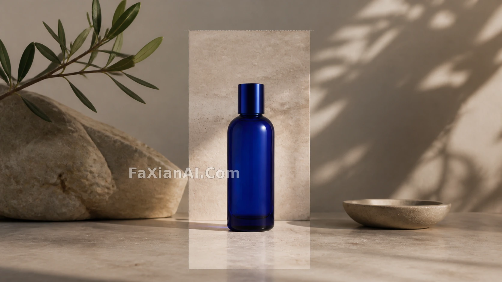
Once the outpaint is done, don't immediately check "does the frame feel bigger" — check two boundaries instead: does the countertop texture stay continuous between the original image and the extended area, and does the product's contact shadow still land in a clear, defined spot. Only move the banner into layout once both hold up.
3. Case 2: When you swap the background, don't let the product look pasted on
Background swaps usually fail not because the background looks bad, but because the bottle's highlights, its cast shadow, and the light of the new environment don't match at all. Prompts should split "what to keep" from "what's allowed to change" — the background can change, but the product facts can't move with it.
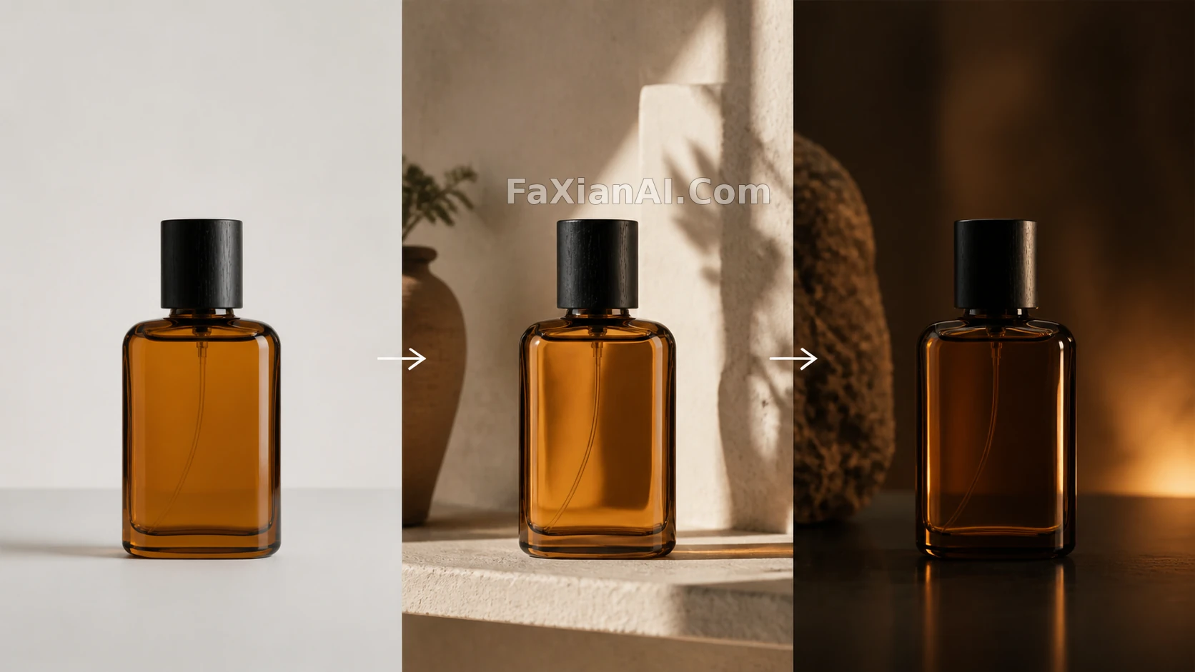
- "Replace only the background: keep the amber perfume bottle's silhouette, cap, label proportions, glass highlights, and the contact shadow in the lower right unchanged. Change the background to a light-colored architectural alcove with afternoon sun coming in, light still from the upper left, shadow falling naturally on the surface."
- "Remove the small glass ornament behind the bottle, continue the background gradient and desktop texture, keep the subject's edges and depth of field intact."
The first works well for generation or full repainting; the second is a better fit for Erase / Inpaint. If the problem involves the product itself, its label, or the main light source, go back to the master shot; if it's just an edge, clutter, or a background seam, handle it with a local edit.
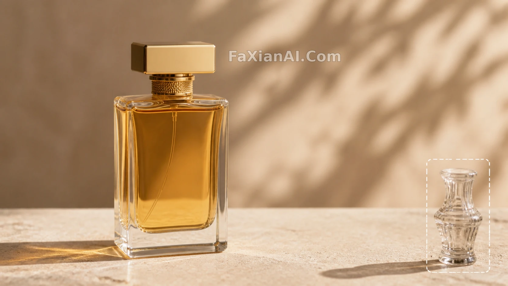
Checking a local edit is especially simple: the patched area shouldn't stand out more than the rest of the original image. If the first thing your eye catches is "the part that got fixed," the texture, grain, depth of field, or shadow still doesn't match.
4. Case 3: A detail page isn't about adding more photos — it's about answering four questions
A detail page isn't a random pile of images. Define a set of "images that answer a question" first: the first shows the whole subject, the second shows the material, the third shows it in use, the fourth shows packaging or a detail. Each image has exactly one job, so readers can take in the product quickly.
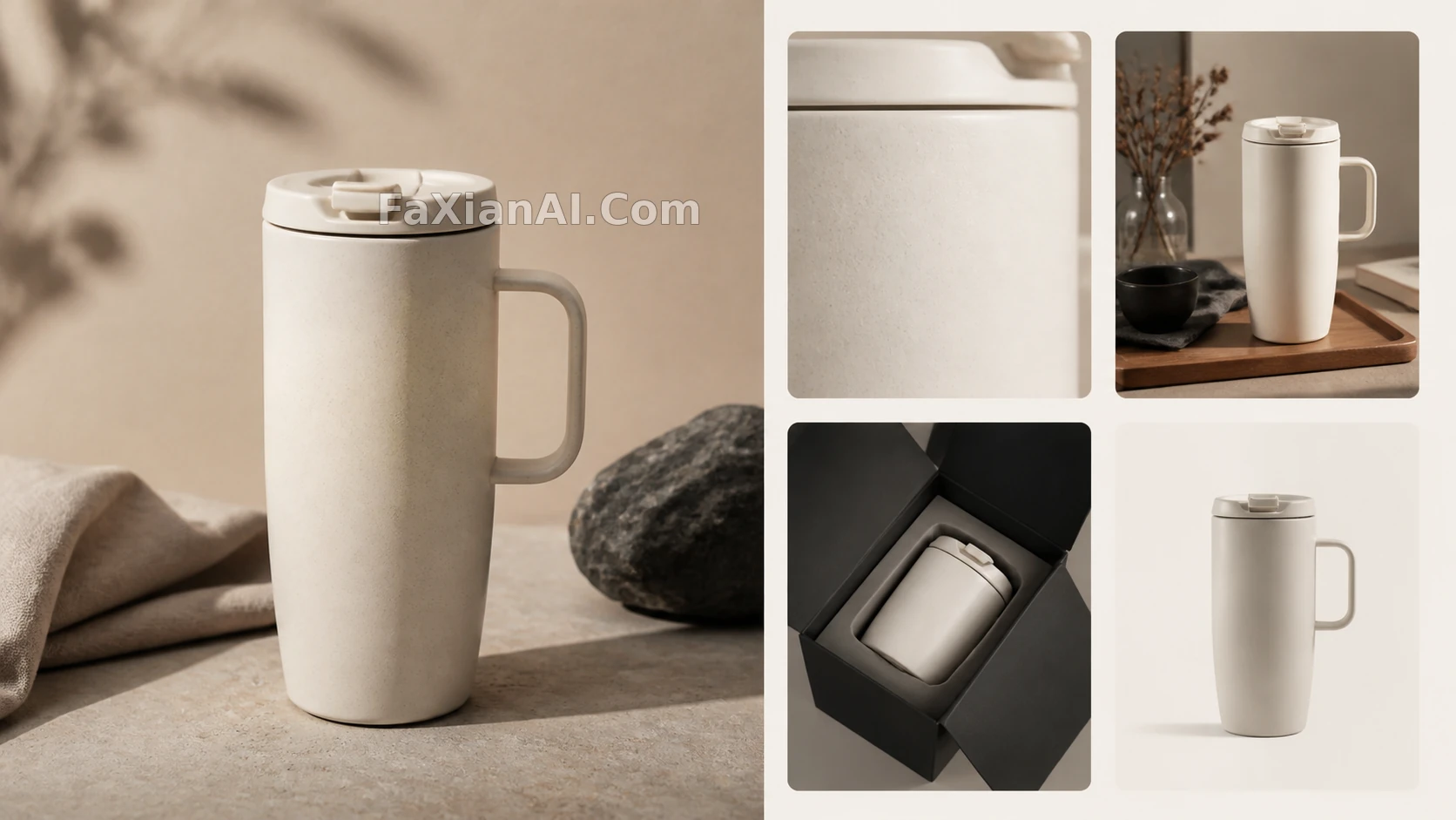
- Hero shot: full silhouette, clean background, product doesn't touch the frame edge.
- Material shot: zoom in on the lid, the glaze, or the texture — no need to fit the whole product in again.
- In-use shot: show scale — held in hand, on a desk, or on the go — without covering the product.
- Detail shot: packaging, how it opens and closes, accessories, all continuing the master shot's color temperature and shadows.
A prompt could read: "Using this travel mug master shot as the sole visual reference, generate a material close-up from the same series; feature only the matte glaze and the lid's sealing ring, keep the warm cream background, soft light from the right, and the same low-saturation palette." Change only one dimension at a time, so the sense of a cohesive series doesn't get eaten up by randomness.
5. Case 4: Use one social visual system to validate a brand direction first
When testing a new brand, you don't need to finish every asset up front. Start with a small visual system: two primary colors, one accent color, one material cue, one composition habit. Then extend a single main KV into a cup, a menu card, a vertical poster, and a social cover, and check whether they still read as the same brand side by side.
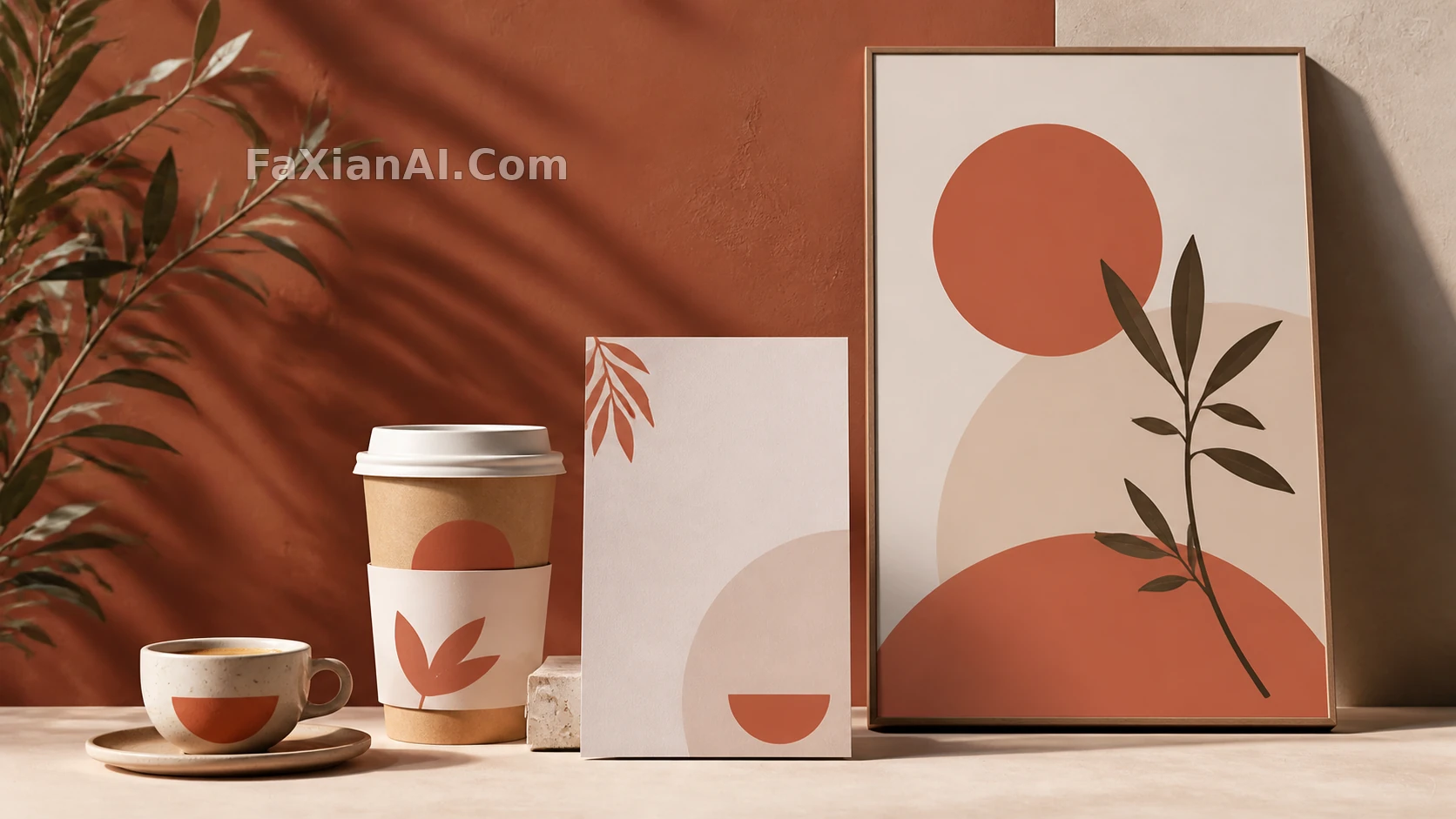
- Visual constraints: "A plain, warm independent coffee shop; cream white, deep brown, terracotta orange; kraft paper and ceramic as the primary materials; natural window light; restrained negative space; no cyberpunk, no neon, no elaborate decoration."
- Vertical social image: "Continue the same palette, ceramic cup shape, wood table texture, and window-light direction; generate a 3:4 vertical composition, leaving roughly the top third clean for text to be added later."
It's still worth laying in the key text afterward, in a design tool. Let AI handle the image, materials, lighting, and layout space, and let a design tool handle the title, price, and selling points that need to be exact — that's the more reliable division of labor.
6. Case 5: Turn "editing one image" into a reusable operating card
What's actually reusable isn't any single prompt — it's an operating card you fill out every single time: subject facts (which features absolutely cannot change), delivery channels (hero/banner/detail page/social, and their aspect ratios), lighting spec (direction, color temperature, shadows), layout spec (negative space for the subject and copy), what's allowed to vary (background/props/angle), and acceptance criteria (should an error send you back to generation or to a local edit). Put this card at the front of every PixPix input, and it'll do a lot more for you than piling on "premium, cinematic, highly detailed" ever will.
7. Final review: don't judge whether it looks good on a single image alone
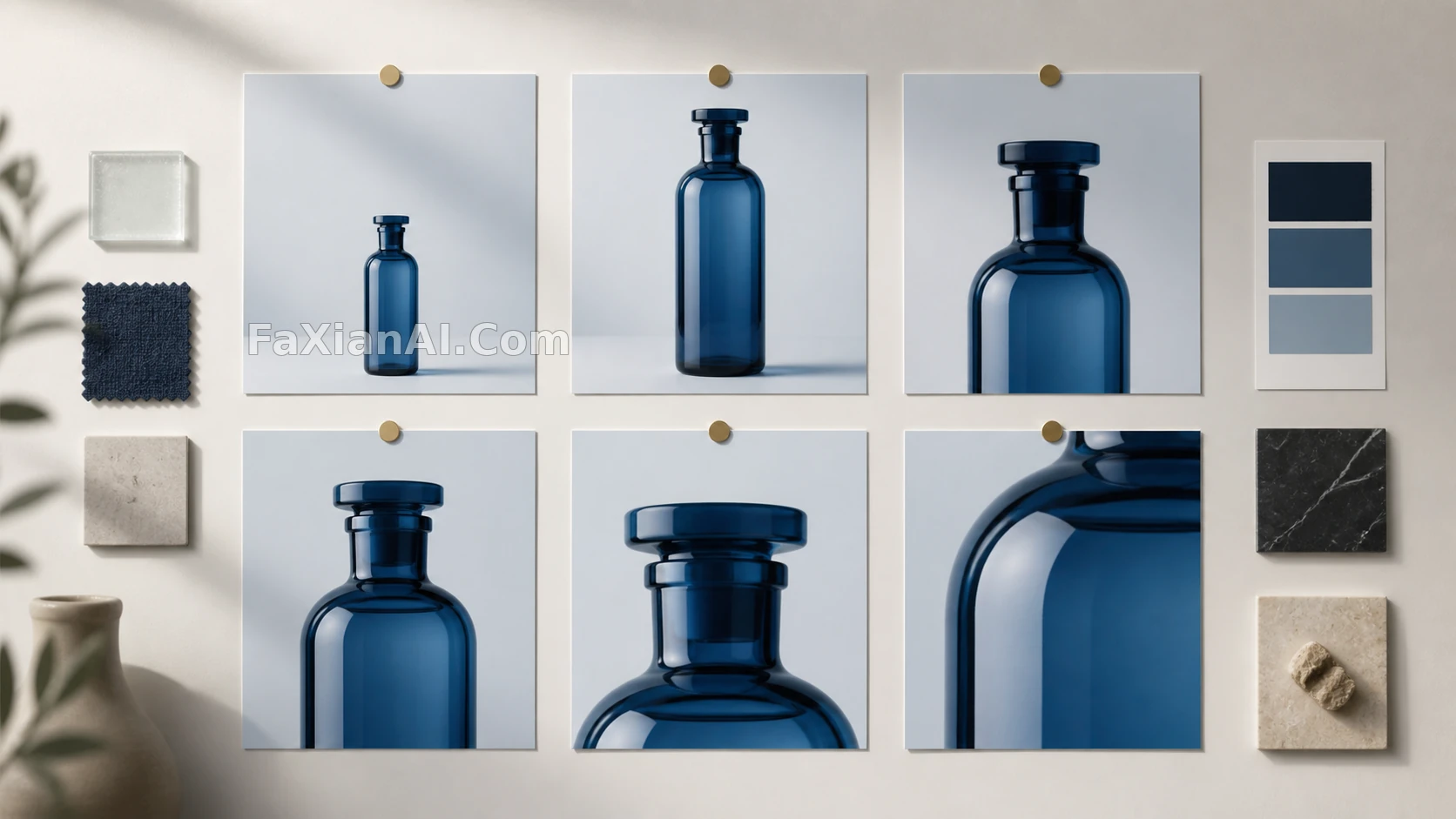
Line up the whole batch and check together: does the product look like the same product in every image? Does the light come from the same direction throughout? Does the background steal attention from the subject? Does the horizontal version actually leave room for a headline? Is the cutout edge clean against both light and dark backgrounds? If any one of these is unstable, don't rush ahead and add more images.
The value of GPT Images 2 + PixPix isn't "producing an image faster" — it's breaking generation, extension, local correction, and format delivery into steps you can actually control. Make one master shot with the right direction first, then build a set of assets that work together — that's the real workflow from inspiration to something you can ship. To practice product-scene prompts further, start with e-commerce product prompts on the site; for more cases, see all image prompt cases. PixPix workbench: pixpix.com/workbench.