這套立體書,為什麼人人都在截圖
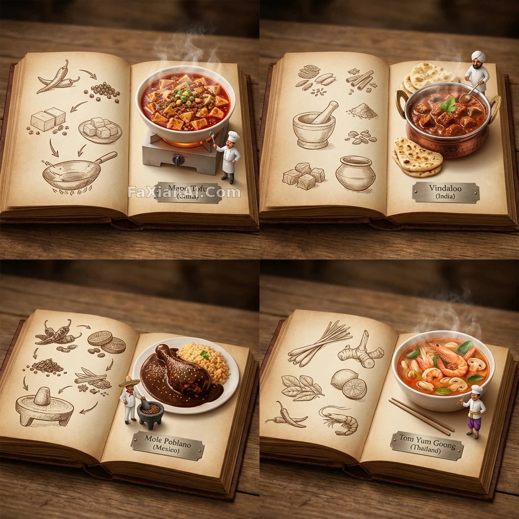
左頁手繪復古草圖,右頁立體美食蹦出來,四國拼一本圖鑑誰看了不想集郵
✍️ 唯一能讀的文字只留一行國名銘牌,其餘全靠畫面說話,這條剋制比塞滿說明文字更讓人願意多看兩眼。
📋 提示詞 YAML 分段式892 字元
<instructions>
[Use the UNIVERSAL WRAPPER exactly as provided above.]
When ingredients are given, choose 4 distinct countries whose signature dishes match those ingredients (hidden gems are welcome). Render one 2x2 grid, each panel showing an open book spread dedicated to that country.
Per panel:
- Right page: a 3D pop-up diorama of the finished, steaming dish rising off the page.
- Left page: 2D vintage sepia sketches (an illustrated recipe flow / timeline, minimal text).
- A tiny chef mini-figure stands beside the dish.
- All 4 books read as one cohesive atlas series.
- The only legible text is an engraved plate reading "Dish ([country name: Country])".
Style: cinematic top-down lighting that emphasizes the 2D-vs-3D depth contrast, macro-level detail, a cohesive atlas design language, clean background, shallow depth of field, no logos, no long blocks of text.
</instructions>
📋 中文譯寫版 自然語言
沿用上面那套通用外殼指令原樣執行。如果給了食材,就挑4個國家、招牌菜剛好對得上這些食材(也歡迎冷門國家)。整體呈現為一張2x2網格,每格是那個國家專屬的一頁立體書攤開效果。每格具體要求:右頁是剛出鍋、還冒著熱氣的立體美食從書頁裡蹦出來的3D立體模型;左頁是2D復古棕褐色手繪草圖(做成插畫版菜譜流程/時間線,文字儘量少);旁邊站一個迷你廚師小人;四本書要看起來像同一套圖鑑系列;唯一能看清的文字是一塊雕刻銘牌,寫著「Dish(國家名,預設Country)」。風格上用電影感俯拍燈光強調2D和3D的深度反差,做到微距級細節,整套圖鑑設計要統一,背景乾淨,淺景深,不出現任何logo,也不堆長段文字。