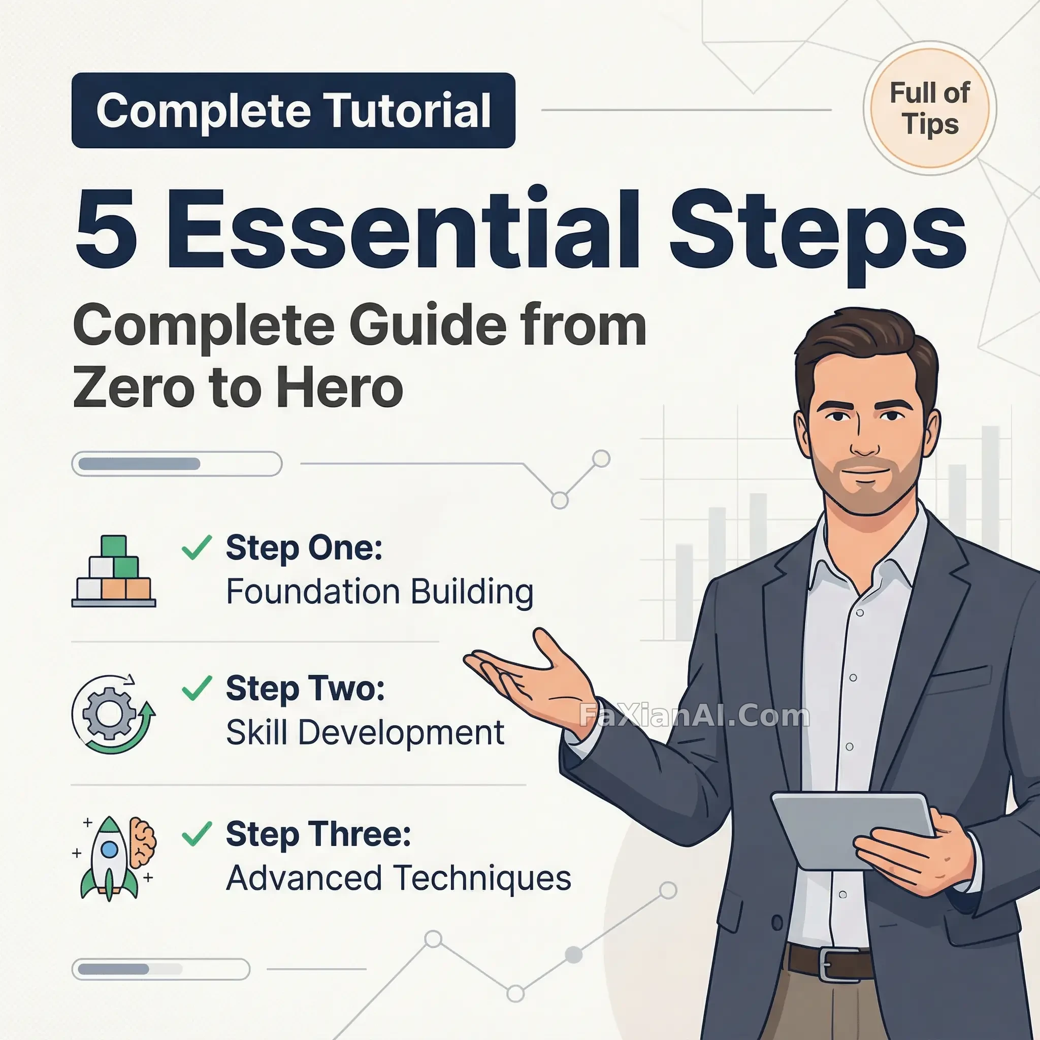
導師人設撐起的五步教程圖
人物佔三分之一站右邊,剩下的地方全用來堆五步大標題,線條比我練出來的還清楚。
✍️ 右三左七這個比例是硬規矩——人物佔三分之一撐住信任感,剩下七成全部讓給標題和清單,步驟別超過五條,多了反而沒人看得完,這套比例換任何教程類封面都通用。
📋 提示詞 自然語言779 字元
A practical-guide thumbnail built around a confident 'mentor' figure — the person from the source photo, explanatory hand gesture, professional expression — placed in the right third of the frame against a clean off-white or light-gray backdrop. Fill the left two-thirds with a dark title bar reading 'Complete Tutorial,' an extra-large bold headline — '5 Essential Steps' — and a subtitle, 'Complete Guide from Zero to Hero.' Below that, list three to five key points as a checklist with icons: Step One – Foundation Building, Step Two – Skill Development, Step Three – Advanced Techniques. Add simple geometric line accents, a chart-style flourish or two, and a corner label reading 'Full of Tips.' Keep the whole thing flat, modern, legible and trustworthy rather than flashy.
📋 中文譯寫版 自然語言
一張實用教程類縮圖,圍繞一個自信的'導師'形象展開——原圖裡的人物,配上講解手勢和專業神情,放在畫面右三分之一處,背景是乾淨的米白或淺灰色。左邊三分之二鋪滿內容:一條深色標題欄寫'完整教程',超大加粗主標題'5個必學步驟',副標題'從零到高手的完整指南'。下方用帶圖示的清單列出三到五個要點:第一步——打基礎,第二步——練技能,第三步——學進階技巧。再加一點簡單的幾何線條裝飾、一兩處圖表式點綴,以及角落一個'乾貨滿滿'的標籤。整體保持扁平、現代、清晰易讀、顯得可信,而不是花哨。