整果與區域性的幼兒詞卡海報
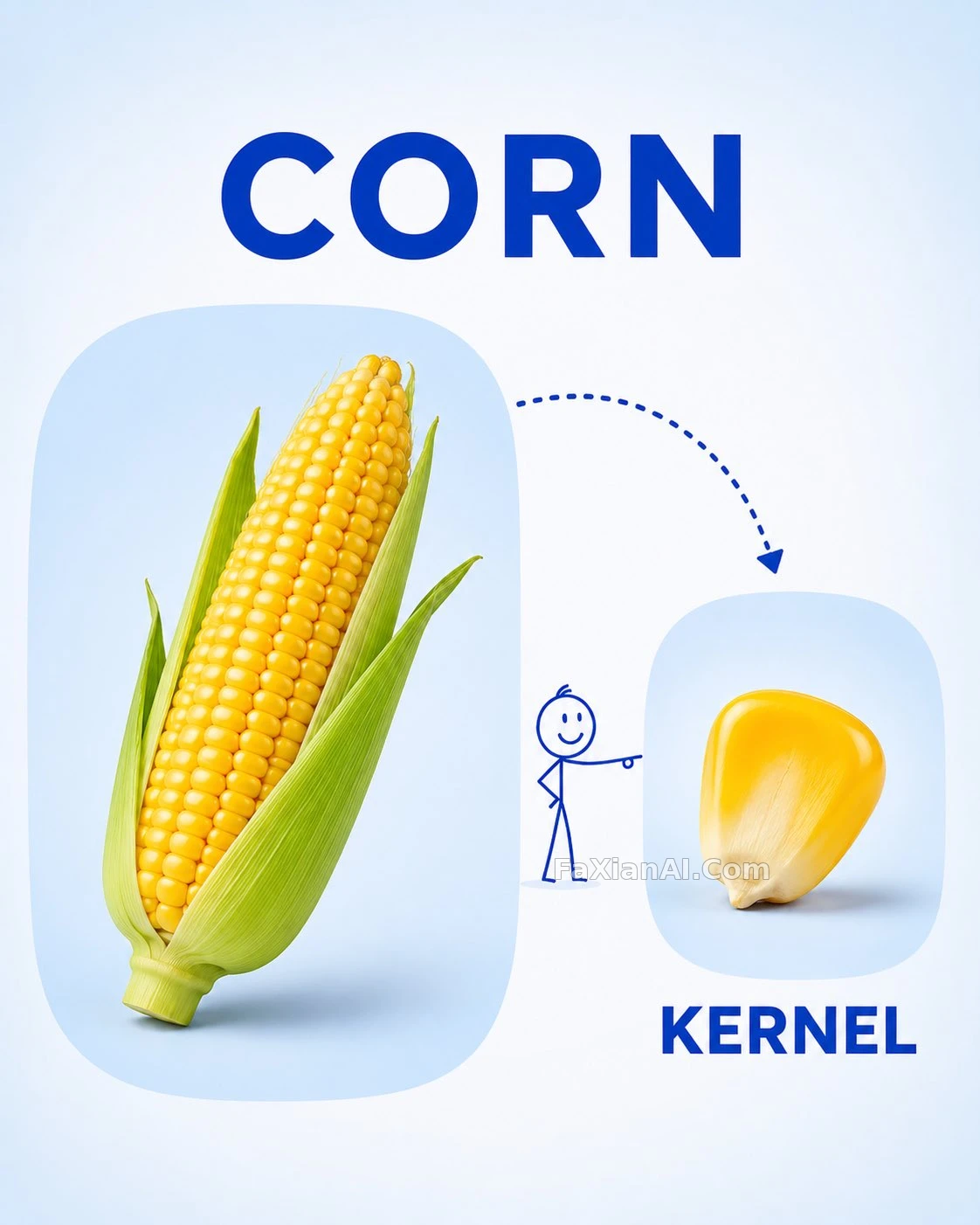
左邊放整顆水果,右邊放區域性,虛線箭頭加火柴人指路,一張圖教會一個詞。
寫法要點
✍️ 模板裡四個方括號變數要成套替換:水果、區域性、兩個單詞,漏一個文字就對不上圖。點選率不看,家長一眼看懂才是指標;火柴人小孩是視線引導,別寫成複雜的卡通角色。
完整提示詞
📋 提示詞 自然語言971 字元
Design a clean, child-friendly educational vocabulary poster for preschool and kindergarten kids, in the spirit of a simple visual learning card. Vertical 4:5 composition, high resolution.
On the left, a large realistic [FRUIT] is the main object; on the right, a smaller image shows a [PART / SLICE / SEGMENT] of that same fruit. A playful dotted curved arrow links the two, and a tiny stick-figure child points toward the smaller part.
Put the word "[FRUIT NAME]" in big bold capitals at the top, and "[PART NAME]" in big bold capitals beneath the smaller image. Background: soft white shading into a very light pastel blue, with rounded image panels, tidy spacing, realistic fruit photography, simple blue lettering and a few minimal, playful illustrations.
The finished design should feel bright, educational, modern and uncluttered, easy for small children to read, like a premium preschool vocabulary card: soft lighting, clear labels, no unnecessary decoration.
📋 中文譯寫版 自然語言
設計一張乾淨、對孩子友好的學前識詞海報,參考簡單的視覺學習卡。豎版 4:5 構圖,高解析度。
左側是一個放大的寫實 [FRUIT] 作為主體;右側用較小的圖展示同一水果的 [PART / SLICE / SEGMENT]。用一條俏皮的虛線弧形箭頭把兩者連起來,旁邊站一個小小的火柴人小孩,指向較小的那張圖。
頂部用粗體大寫寫出 "[FRUIT NAME]",較小圖片的下方用粗體大寫寫出 "[PART NAME]"。背景從柔白漸變到很淺的粉藍色,配圓角圖片框、整齊的留白、寫實水果攝影、簡潔的藍色字型和少量極簡俏皮的插畫。
成品要明亮、有教育感、現代而不雜亂,小朋友一眼能懂,像一張高階的學前詞彙卡:光線柔和、標註清楚、沒有多餘裝飾。