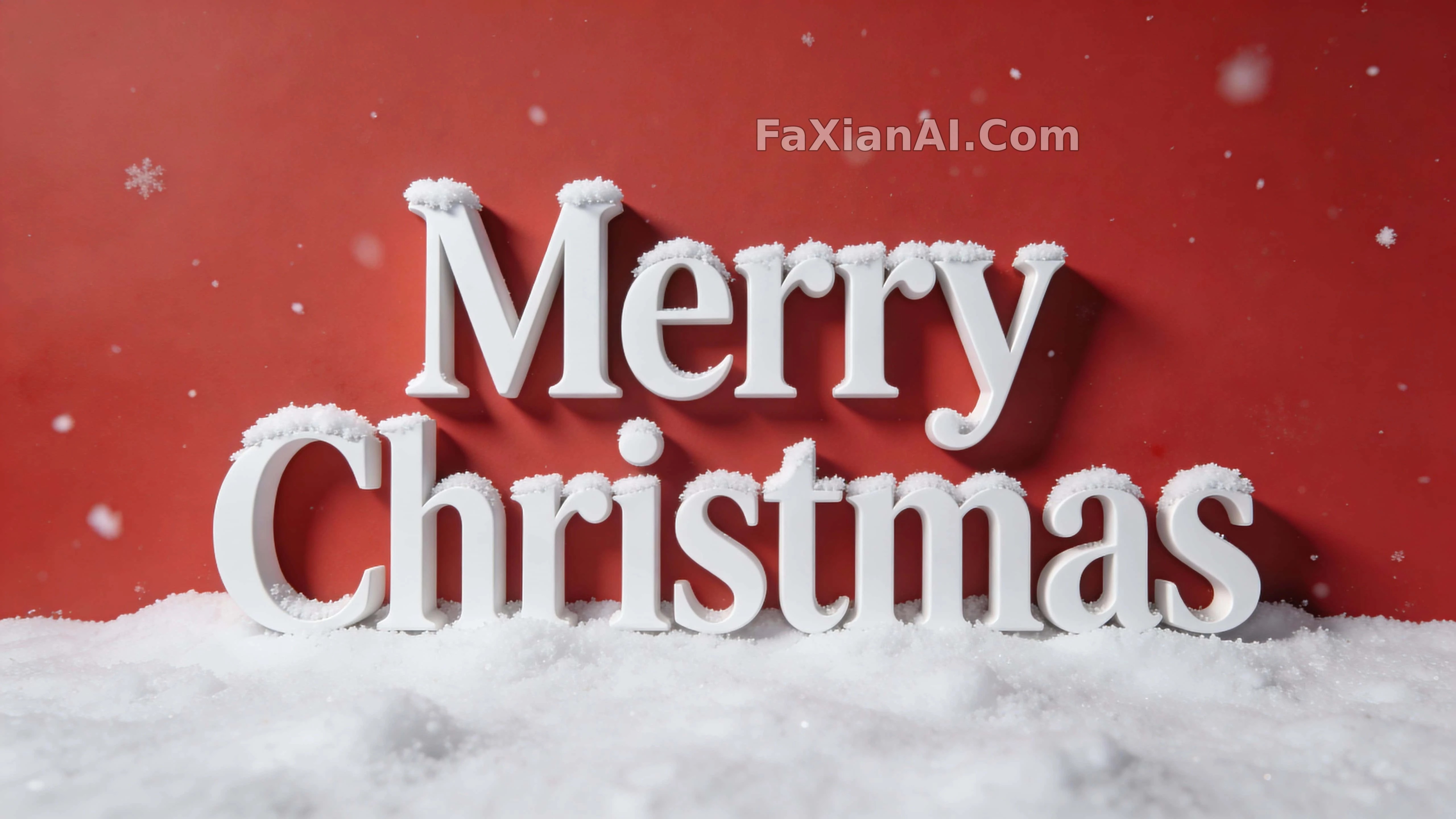
红底上立体字落了层薄雪
积雪只落在字母顶部边缘,这个细节处理让纯色背景的立体字摆脱了廉价贺卡感。
✍️ 字体类设计最容易崩的是『完整可见不被裁切』,这条提示词把它写成硬指标而不是建议。积雪只压在顶缘而非整字覆盖,是让立体感和可读性同时成立的分寸。
📋 提示词 自然语言
White “Merry Christmas” typography fills the frame at a medium scale that stays fully inside the margins, held in a centered composition with generous breathing room on every side. The lettering reads elegant and dimensional, soft realistic snow resting along the top edges of each letter with subtle snow particles drifting nearby, a soft shadow grounding the whole word beneath studio lighting. A solid red background carries the clean, minimal design, the text staying fully visible with no cropping anywhere, rendered at high resolution.
📋 中文译写版 自然语言
白色『Merry Christmas』立体字占据画面中等篇幅,完整落在边距之内,构图居中,四周留出充足的呼吸空间。字体造型优雅立体,每个字母的顶部边缘都落着一层逼真的积雪,周围飘着细微的雪粒,柔和的投影在影棚光下把整个单词稳稳固定在画面里。纯红色背景衬出干净极简的设计感,文字完整可见、不被裁切,整体呈现高分辨率成像。