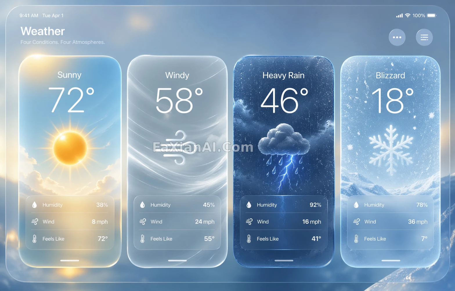
四张卡片,各自安静地发光
四种天气各占一格,玻璃质感把情绪都收得很稳。
✍️ 先别急着夸玻璃质感多通透,真正分出四张卡差异的是配色克制的程度——同一套材质,只换色温和粒子类型,情绪就分开了。这套逻辑换成别的状态类UI也成立。
📋 提示词 YAML 分段式1789 字符
A high-fidelity next-generation mobile OS weather dashboard in landscape layout, rendered in a premium frosted liquid-glass style. Four weather cards line up horizontally, each covering a different condition: Sunny, Windy, Heavy Rain, Blizzard.
The overall design reads like a cutting-edge system UI concept — translucent frosted glass panels, soft reflections, subtle refraction, glowing edges, background blur, layered depth, ultra-refined minimalism. Treat it like a flagship OS keynote render rather than a generic dashboard.
Each card shares the same design language but carries its own mood:
Sunny: warm gold, soft white, sky blue, sunlight glow, bright airy feel, elegant sun icon.
Windy: cool white, pale gray-blue, silver tones, flowing wind trails, motion lines, airy speed sensation, minimal and refined.
Heavy Rain: deep blue, graphite gray, electric blue accents, storm clouds, wet-glass texture, raindrops, subtle lightning glow, dramatic but controlled.
Blizzard: icy blue, white, soft silver, snow particles, frosty haze, frozen crystal feel, cold and clean.
Every card carries a weather title, a large temperature number, an elegant weather icon, and small supporting data like humidity, wind speed, feels-like temperature.
Visual requirements: premium liquid-glass aesthetic, ultra-detailed, crystal-clear hierarchy, large rounded corners, polished translucent materials, realistic soft highlights, clean typography, spacious layout, futuristic yet usable, refined micro-contrast, strong depth and atmosphere.
Background stays minimal and elegant, supporting the glassmorphism composition without clutter. The final image should feel like a luxury weather-app hero screen — cohesive, cinematic, product-focused, with strong material realism and impeccable alignment.
📋 中文译写版 自然语言
一张高保真的次世代移动系统天气看板,横版布局,走高级冷凝液态玻璃质感。四张天气卡片横排展示不同天气:晴天、大风、暴雨、暴雪。
整体设计要有旗舰系统UI概念的气场——半透明磨砂玻璃面板、柔和反光、细腻折射、发光边缘、背景虚化、层次分明,风格极度精炼极简,像旗舰系统发布会渲染图而非普通仪表盘。
四张卡片共用同一套设计语言,但各自氛围不同:晴天卡是暖金、柔白、天蓝,带日光光晕和明快通透感,配精致的太阳图标;大风卡是冷白、浅灰蓝、银色调,带流动的风迹线和运动线条,轻盈有速度感,克制精致;暴雨卡是深蓝、石墨灰配电光蓝点缀,暴雨云层、湿玻璃质感、雨滴与隐约的闪电光,戏剧感但不失控;暴雪卡是冰蓝、白、柔银色,雪花颗粒、冷雾与冰晶质感,冷冽干净。
每张卡片都包含天气标题、大号温度数字、精致的天气图标,以及湿度、风速、体感温度等辅助小数据。
视觉要求:高级液态玻璃美学、超高细节、层级清晰、大圆角、精致的半透明材质、真实柔和高光、干净的字体排版、宽松布局,未来感又保留可用性,微对比精致克制,具备强烈的纵深与氛围感。
背景保持极简高级,衬托玻璃拟态构图而不显杂乱。最终成片要有奢华天气App主视觉的质感——统一、有电影感、聚焦产品本身,材质真实、对齐精准。