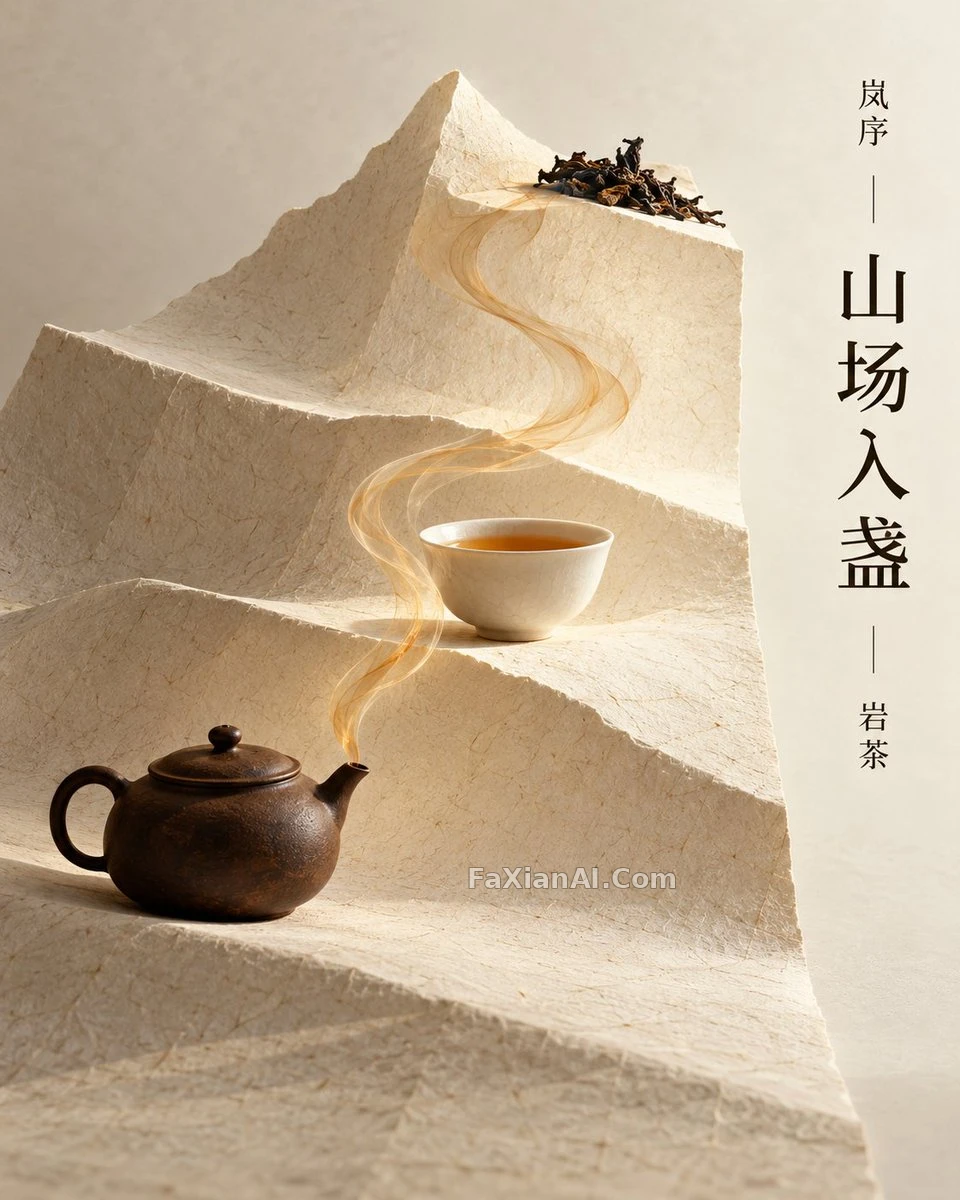
宣纸折成山脊的岩茶海报
一张暖白宣纸折成三层山脊,茶壶、茶盏、茶叶各占一层,一缕茶烟把它们连起来。
写法要点
✍️ 这张的聪明处是把“山”做成纸的折叠,而不是画山,所以茶烟只能沿折痕走,构图被材料逼出了秩序。末尾那串“不要”同样重要,专门挡住茶行业最常见的禅意套路。
完整提示词
📋 提示词 自然语言1838 字符
Brief: an Oriental Tea Review Sample. The brand is the original fictional 'Lan Xu', the product is 'Rock Tea' (Yancha), and the main title is 'Mountain Field Entering Cup'.
Picture: imagine a single, tall sheet of warm-white Xuan paper that rises from the bottom edge and folds into three pages at different heights. They look like abstract mountain ridges, yet the paper stays physical, with real thickness, visible fibers and creases. A small dark brown teapot rests on the lowest fold, a white porcelain tea cup on the middle fold, and a few dried rock tea leaves, nothing more, on the top fold. Scale is realistic and nothing overlaps.
Core composition: 'Binding Fold Pages - Mountain Path Layers - Tea Smoke Connection'. From the teapot's spout, one wisp of amber tea smoke climbs along the folded mountain paths to reach the cups. It reads like restrained ink-wash writing, thicker in some places and thinner in others, and it must never turn into a specific character, dragon or phoenix.
Typography: the main title 'Mountain Field Entering Cup' runs vertically, set in a modern Song typeface, in the white space on the right. 'Lan Xu' appears small at the top and 'Rock Tea' small at the bottom. Use no other words: no prices, awards, specs, dates, origins or slogans.
Color: warm white, rock brown, tea-soup amber, and only a touch of ink black.
Output rules: a single 4:5 vertical commercial poster, with no collage and no multi-panel grid. Invent the brand; never imitate an existing brand's packaging, logos or ads. Bring it to the polish needed for a creative-direction review, with believable structure and materials, a clear layout and no watermarks. Exclude people, ancient costumes, real tea-room scenes, full-frame landscapes, large calligraphy, gold borders, Zen clichés, complex packaging and multi-image collages.
📋 中文译写版 自然语言
题目:东方茶评样张。品牌是原创虚构的“岚序”,产品是“岩茶”,主标题是“山场入盏”。
画面:设想一张竖长的暖白宣纸,从底边升起,折成三页高低不同的折页,像抽象的山脊,但纸仍然是实物,有真实的厚度、可见的纤维和折痕。最低一层放一只深棕色小茶壶,中间一层放一只白瓷茶盏,最高一层只放几片干燥的岩茶叶,再无其他。比例真实,互不重叠。
核心构图:“装订折页—山路层叠—茶烟相连”。从壶嘴升起一缕琥珀色茶烟,沿着折出来的山路爬向茶盏,像克制的水墨书写,浓淡各处不同,但绝不能变成具体的字、龙或凤。
文字:主标题“山场入盏”用现代宋体竖排在右侧留白处,“岚序”小字在顶部,“岩茶”小字在底部。不得出现其他文字:没有价格、奖项、参数、日期、产地或口号。
配色:暖白、岩褐、茶汤琥珀,只用一点墨黑。
输出规则:只出一张 4:5 竖版商业海报,不拼贴、不做多宫格。品牌必须自创,不得模仿现有品牌的包装、标志或广告。成图达到可供创意总监评审的完成度,结构与材质可信、版面清晰、无水印。排除:人物、古装、真实茶室场景、满幅山水、大幅书法、金边、禅意套路、复杂包装、多图拼贴。