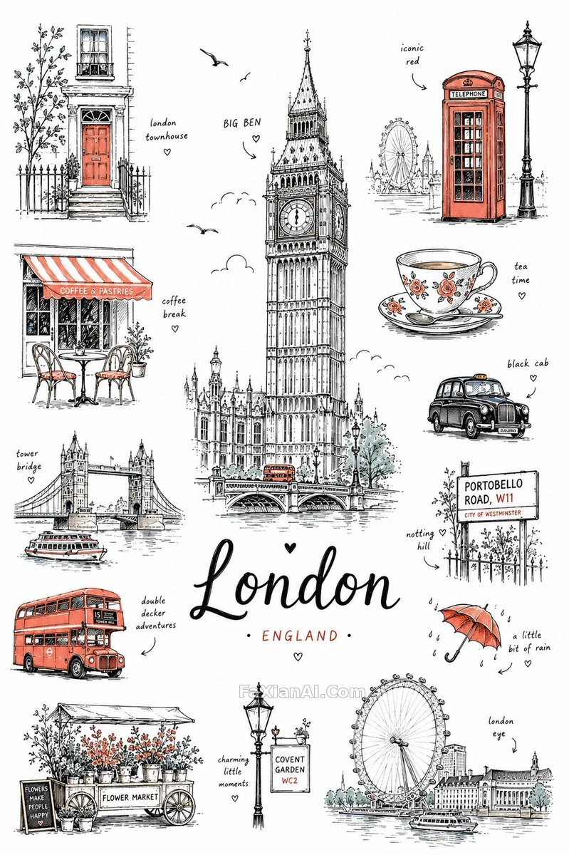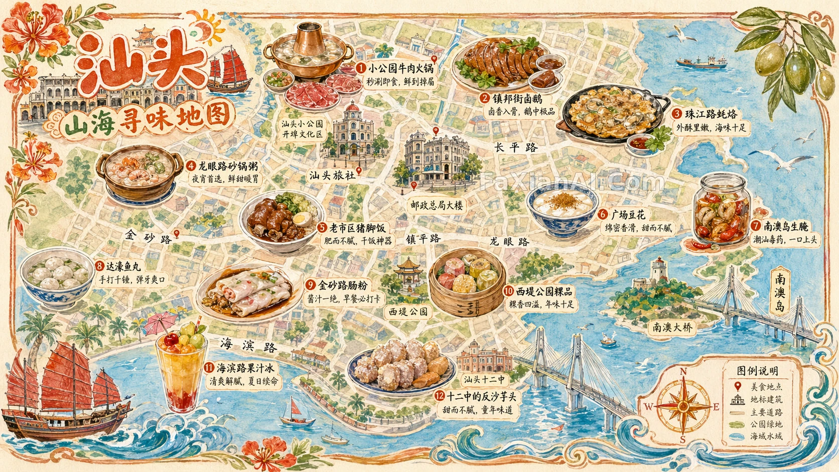
一块黑板粉笔感画出的知识点
从长文章里提炼出重点,全靠粉笔在黑板上画,连配图都得是粉笔质感不能穿帮成写实图。
✍️ 最容易穿帮的地方是配图——图标和肖像也得用粉笔质感画,一旦掉进写实风格就前功尽弃;信息密度上要克制,留白比塞满关键词更抓人眼球。
📋 提示词 自然语言
Pull the core themes and key points out of the source material and turn them into a chalkboard-style infographic: black chalkboard background, hand-drawn chalk texture, landscape 16:9 layout. Keep the text tight, push the keywords and core ideas forward, and leave enough breathing room that the main points read at a glance. A few simple cartoon touches, icons or recognizable portraits can add interest and help things stick in memory — but render everything, images included, in colored chalk with no photoreal elements. Match the output language to the source content unless told otherwise.
📋 中文译写版 自然语言
从原始材料里提炼出核心主题和关键点,做成黑板风格的信息图:黑色黑板背景,粉笔手绘质感,16:9横版构图。文字要精简,关键词和核心概念摆在最前面,留足够的空白让人一眼抓住重点。可以加一点简单的卡通元素、图标或可辨认的人物肖像来增加趣味和记忆点——但包括这些配图在内,全部都要用彩色粉笔质感呈现,不能出现写实元素。除非特别要求,输出语言要跟原始内容的语言保持一致。