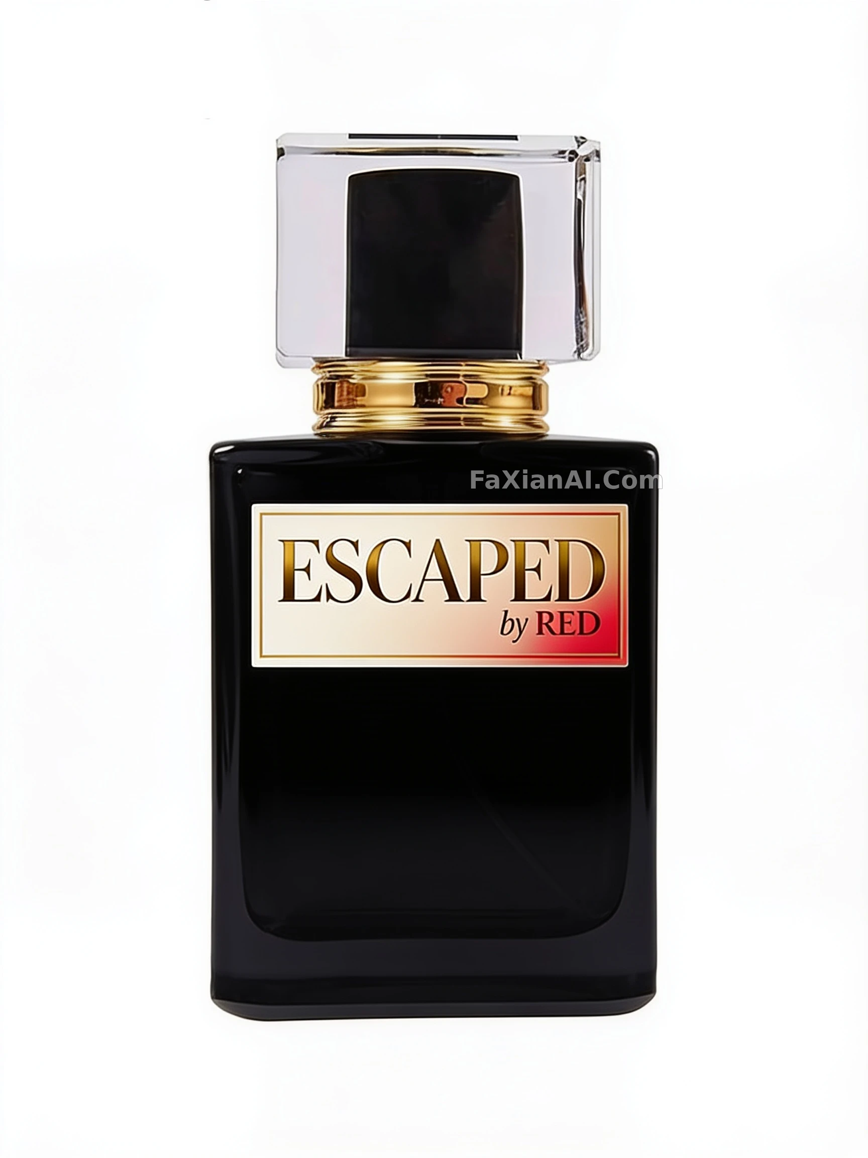
黑瓶上烫金配象牙白的香水标签
给黑色香水瓶设计贴合曲面的高端标签,金、象牙白、红三色定调。
✍️ “spell it exactly as written”这句不能省,AI最爱把字母印歪。金、象牙白、红别平分秋色,金色压一压,红色只当点缀,主次一拉开,对版也省事。
📋 提示词 自然语言707 字符
Label design brief for a black perfume bottle. Brand text: “ESCAPED by RED” (reproduce the spelling letter for letter). The artwork has to sit within the front surface of the bottle and follow its shape, looking upscale and polished against the black finish. Typography should be elegant and highly readable; build the palette from metallic gold, warm ivory and a touch of red. Composition stays clean and balanced, with “ESCAPED” dominant and a smaller “by RED” placed just below it. Render the label as a believable printed piece, smoothly applied and wrapping the bottle's curvature. Constraints: the bottle itself stays unchanged, no additional wording, and nothing drawn outside the label's boundaries.
📋 中文译写版 自然语言
为一只黑色香水瓶设计奢华标签。香水名为“ESCAPED by RED”,必须严格按原样拼写。标签要贴合瓶身形状和正面可用的面积,整体精致高端,与黑色瓶身相配。使用优雅的字体、很强的可读性和高级的配色,例如金属金、暖象牙白和红色。版面保持干净均衡:“ESCAPED”是视觉主体,“by RED”缩小放在它正下方。标签要看起来真实,像专业印刷后平整贴在瓶上,顺着瓶身曲面走。不要改动瓶子、不要添加其他文字,也不要把设计放到标签区域之外。