旅行记忆卡做旧成老式探险收藏页
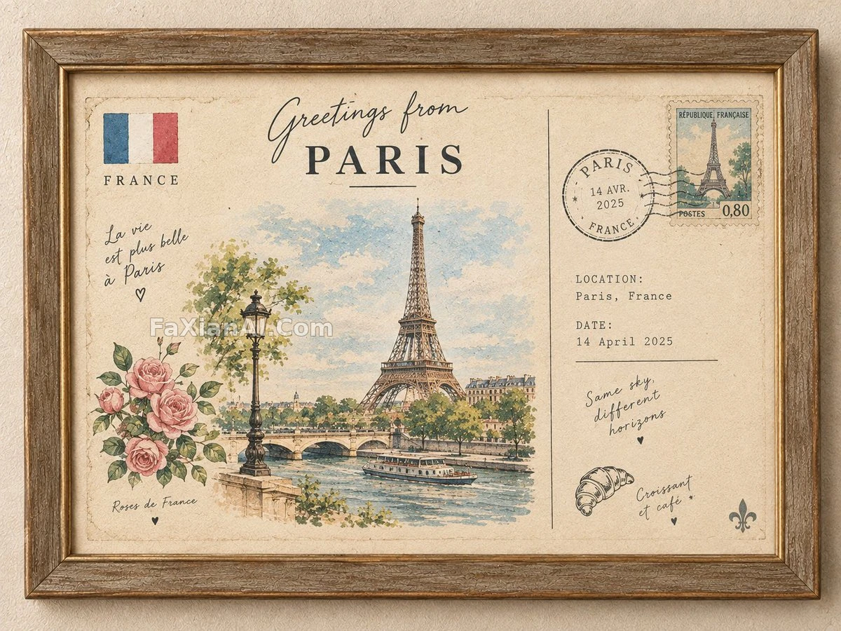
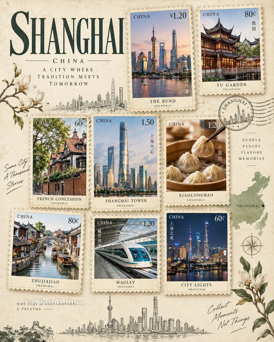
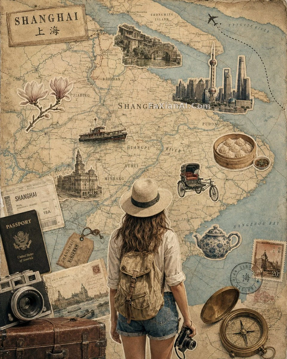
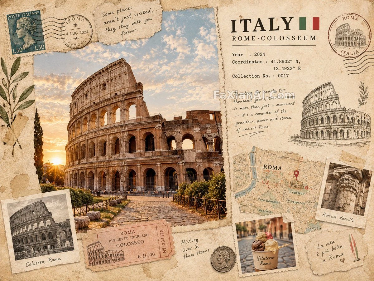
地图碎片配车票和坐标手写字,撕边做旧比新照片更让人想收藏。
✍️ 我们家那本旧相册就长这样,纸边卷了角,字迹也褪了色,[DESTINATION]换成任何地名都能套,坐标编号和收藏编号这些细节才是让人愿意多看两眼的地方,不是那个地标建筑。
📋 提示词 自然语言1324 字符
Picture a keepsake travel card for [DESTINATION] as though it were torn from an old-world explorer's private scrapbook, elegantly composed. [ICONIC LANDMARK] sits at its heart, ringed by locally true touches — building shapes, ways of getting around, dishes, plants, heirloom objects, streetscapes, cultural emblems, whichever fit the place.
Blend several textures into one frame: small-scale realistic photography, sketched linework, aged archival snapshots, torn fragments of a map, stamps, ticket stubs, notes in a human hand, coordinate figures, loose bits of travel ephemera.
The base is aged paper carrying natural grain, colors muted and pulled from the destination itself, gentle shadow, printing that is not quite perfect, ink gone soft, edges torn by hand, a scattering of handwritten notes.
Work a modest title into the layout — [DESTINATION] — next to a YEAR, a COORDINATES line, a COLLECTION NO., and one short line of travel commentary.
Aim overall for an editorial travel-journal feel: handmade materials you can sense the texture of, imperfections left in on purpose, a composition that stays balanced, room left empty on purpose, dense in detail yet still grounded in realism — the sense of a premium collectible souvenir, never a cartoon, never a stock tourist poster, nothing overdecorated or crowded.
📋 中文译写版 自然语言
想象一张为[目的地]做的纪念旅行卡,仿佛是从一位旧时代探险家的私人剪贴簿上撕下来的一页,构图优雅。[标志性建筑]居于画面核心,周围环绕着真正属于当地的细节——建筑形态、出行方式、当地食物、植物、传家老物件、街景、文化符号,视目的地而定。
把几种质感揉进同一个画面:小尺度写实摄影、手绘线稿、泛黄的档案老照片、撕碎的地图残片、邮票、票根、手写的字条、坐标数字、零散的旅行纸质小物。
底色是带着天然颗粒的泛黄纸张,色调低饱和且取自目的地本身,光影柔和,印刷带点不完美,墨迹有些发虚,边缘是手撕的痕迹,还散落着几处手写批注。
在版面里嵌入一个小标题——[目的地]——旁边配上YEAR(年份)、COORDINATES(坐标)一行、COLLECTION NO.(收藏编号),以及一句简短的旅行随笔。
整体追求编辑级旅行手记的气质:能摸到质感的手工材料、故意保留的不完美、维持平衡的构图、刻意留出的空白、细节丰富却依然扎根于写实——呈现出高级收藏纪念品的感觉,绝不卡通化,不是廉价旅游海报模板,不堆砌装饰也不显拥挤。