MODEL COMPARISON
Ideogram 4 vs Krea 2:同一个需求该用哪个
站内两边分别有 4 组和 4 组可复现案例。下面从擅长场景、提示词写法到实际成图逐项对照。
一句话结论
Ideogram 4 更适合Poster and headline typography;Krea 2 更适合Aesthetic tone and surface quality。同一个想法在两边各跑一次往往更划算——它们"听话的方式"不一样,提示词的写法也要跟着调。
擅长场景与写法对照
Ideogram 4
Lock the wording in quotes, then describe the type's character (sans, handwritten, serif) and the hierarchy of the layout. Don't push more than three blocks of text into one image — they start crowding each other.
Krea 2
Rather than reciting style terms, describe what kind of occasion this picture would turn up at. When blending, state the ratio (seven parts A, three parts B) — it reads that phrasing accurately.
Ideogram 4 的案例
 Tropical Dusk at the End of the Dock
 Crack the Coconut, and the Beach Picnic Begins
 The Glance Back, Right as the Dress Lifts
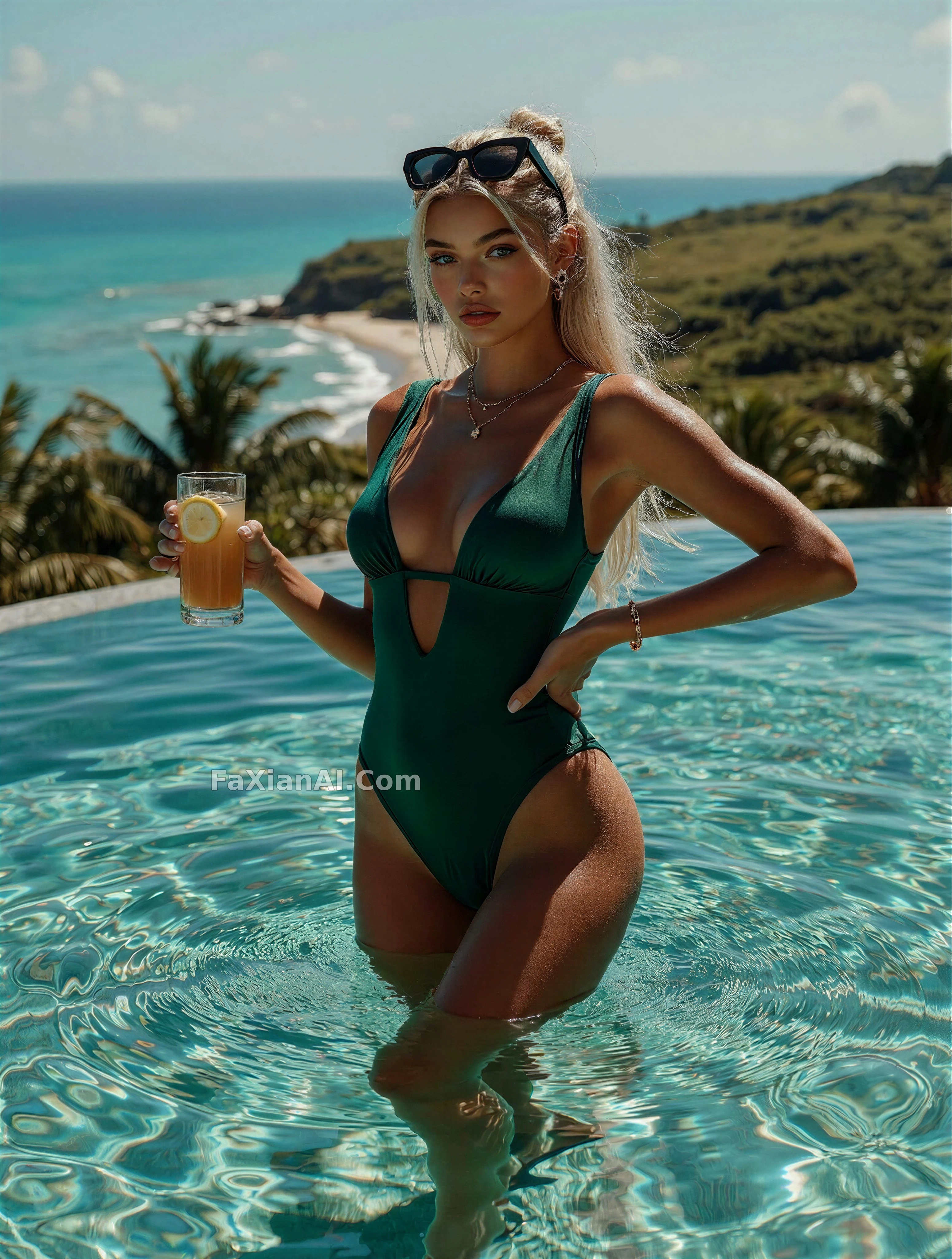 Pool Level, Roughly Equal to the Horizon