
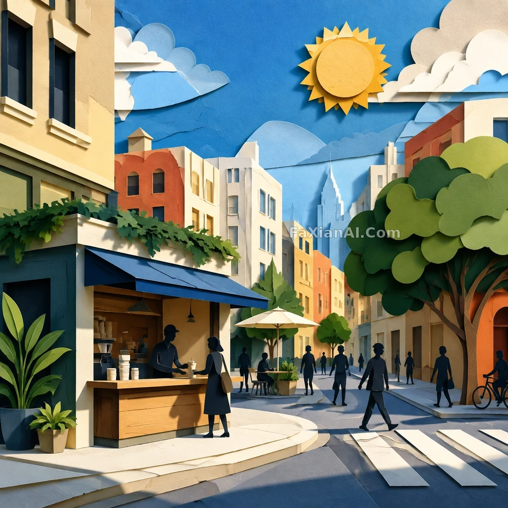
A Summer City Poster Cuts the Sunlight Into Little Squares
✍️ The strength of this kind of paper-cut poster is that depth comes from light and shadow rather than piled-on color, and cutting the sunlight into a grid is the key variable. The risk is that too many layers fall apart visually — staying within three layers is safest.
📋 Prompt Natural Language
Generate a square, high-resolution finished image: a text-free paper-cut city poster with blocks of sunlight, a corner coffee kiosk, pedestrian silhouettes, and layered blue sky — energetic yet restrained. It should look like a hero image from an Imagefx case study — a clear subject, a strong sense of a captured moment, crisp detail, and believable lighting. No text, letters, numbers, logos, watermarks, readable signage, fake UI, low-resolution blur, collages, borders, or multi-image grids.
Related Cases
 No Filter for the Heat, Just Watermelon Juice Dripping
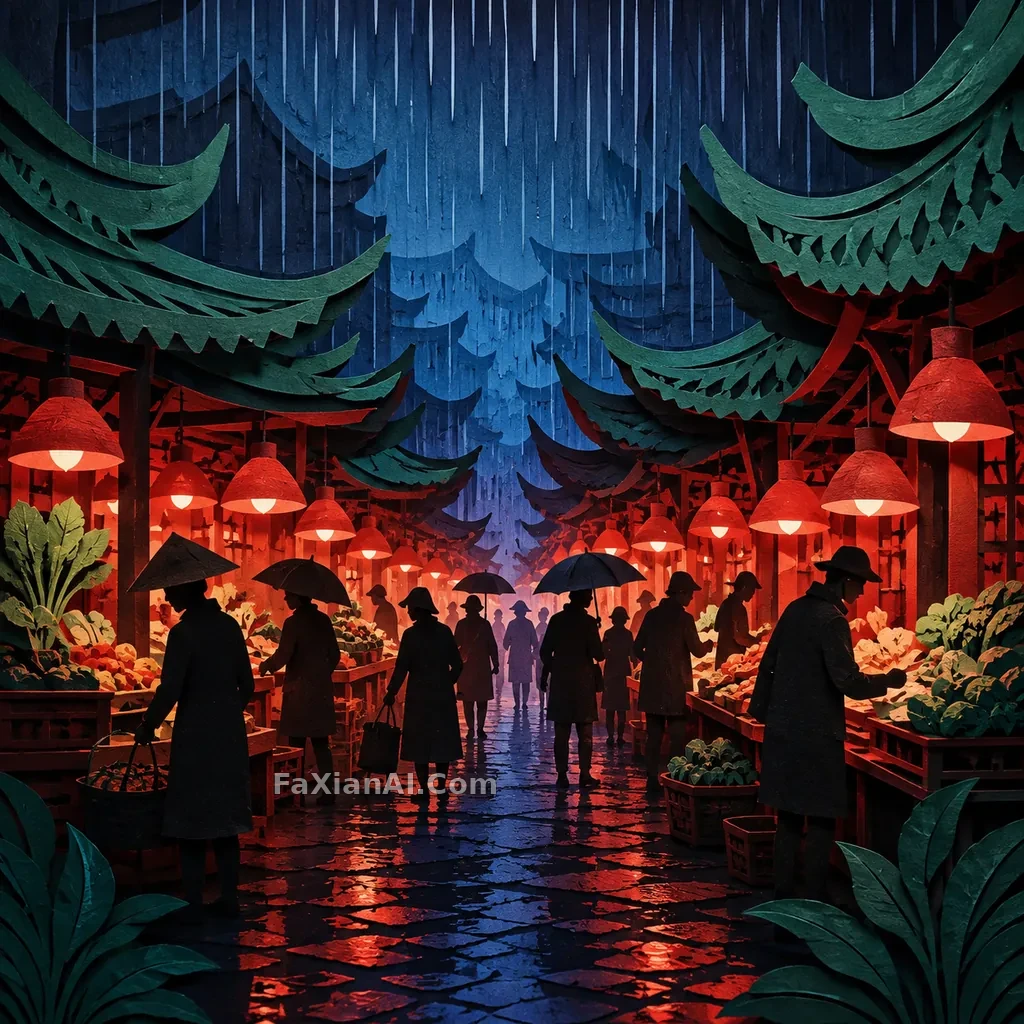 A Rainy Market Poster Cut Into Red, Green, and Blue
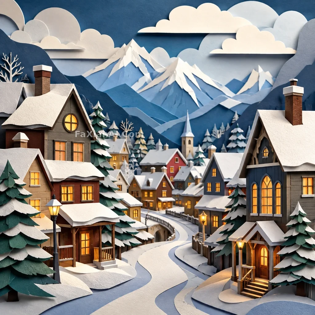 A Snow Town Travel Poster Cut Into Three Layers of Warm and Cool Paper
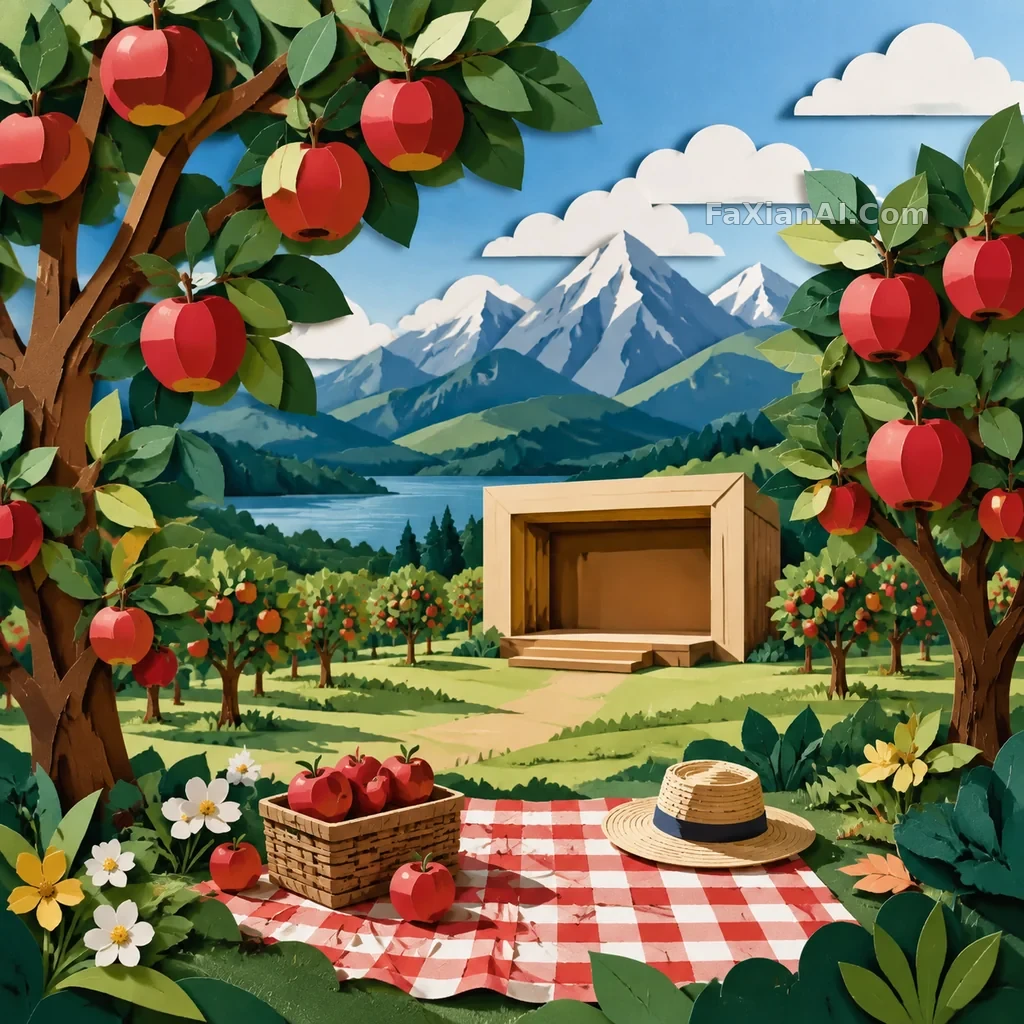 An Orchard Travel Poster Like a Paper Box Being Opened
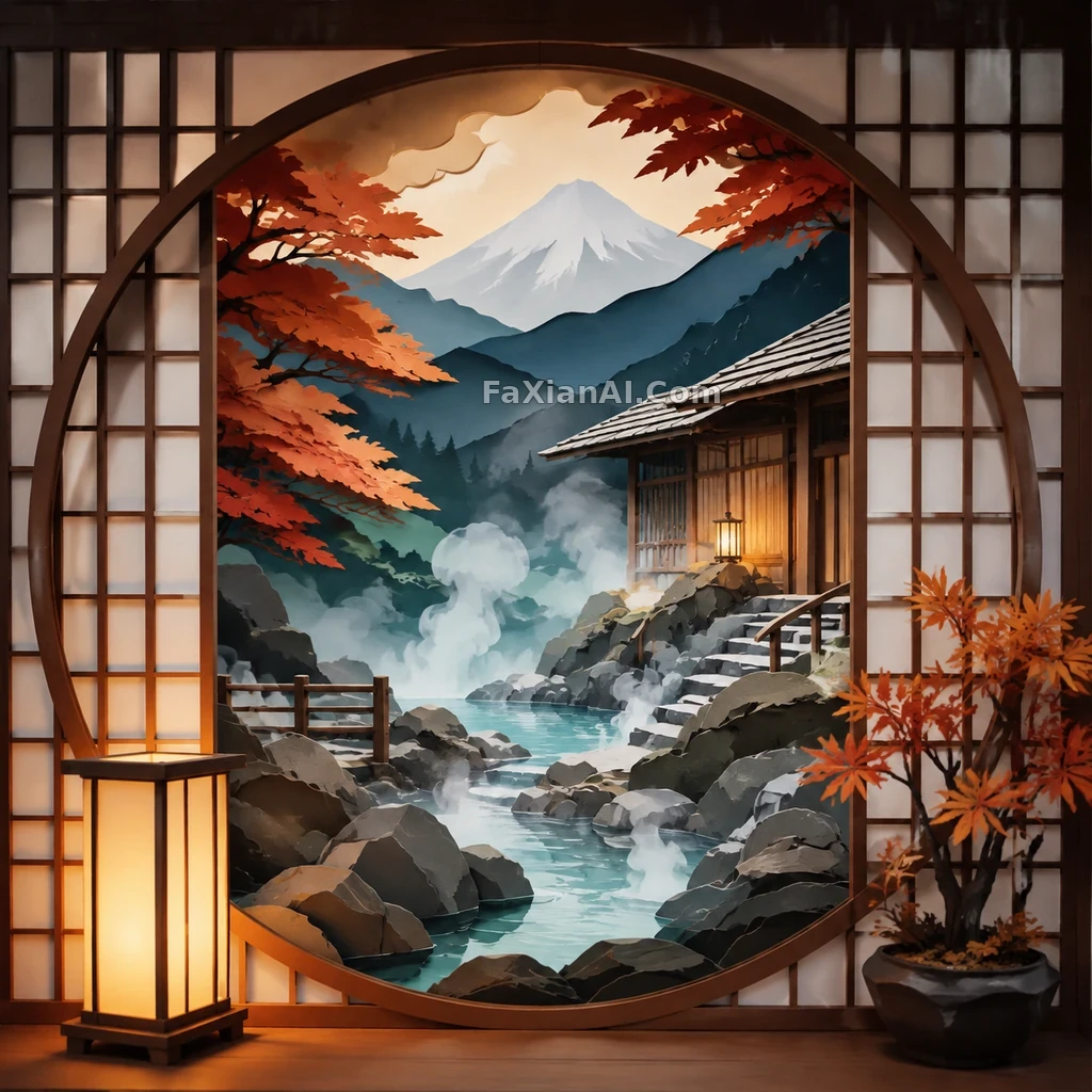 A Hot Spring Inn Poster That Keeps Only Mist and Lattice Windows
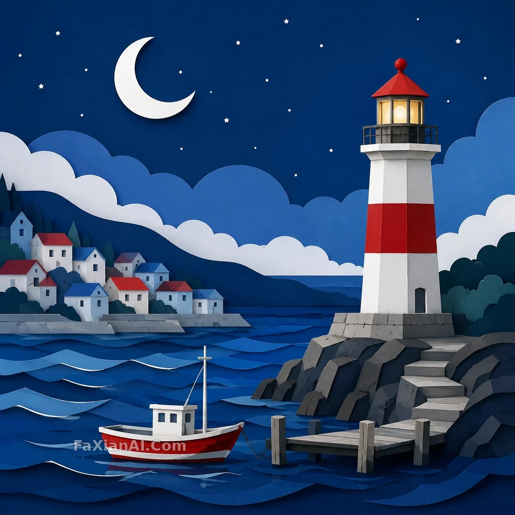 A Harbor Moon Cut Into a Text-Free Travel Ticket