Home › Photo Editing › Pulling a Papercut Poster's Colors Back Into One Mood
Pulling a Papercut Poster's Colors Back Into One Mood
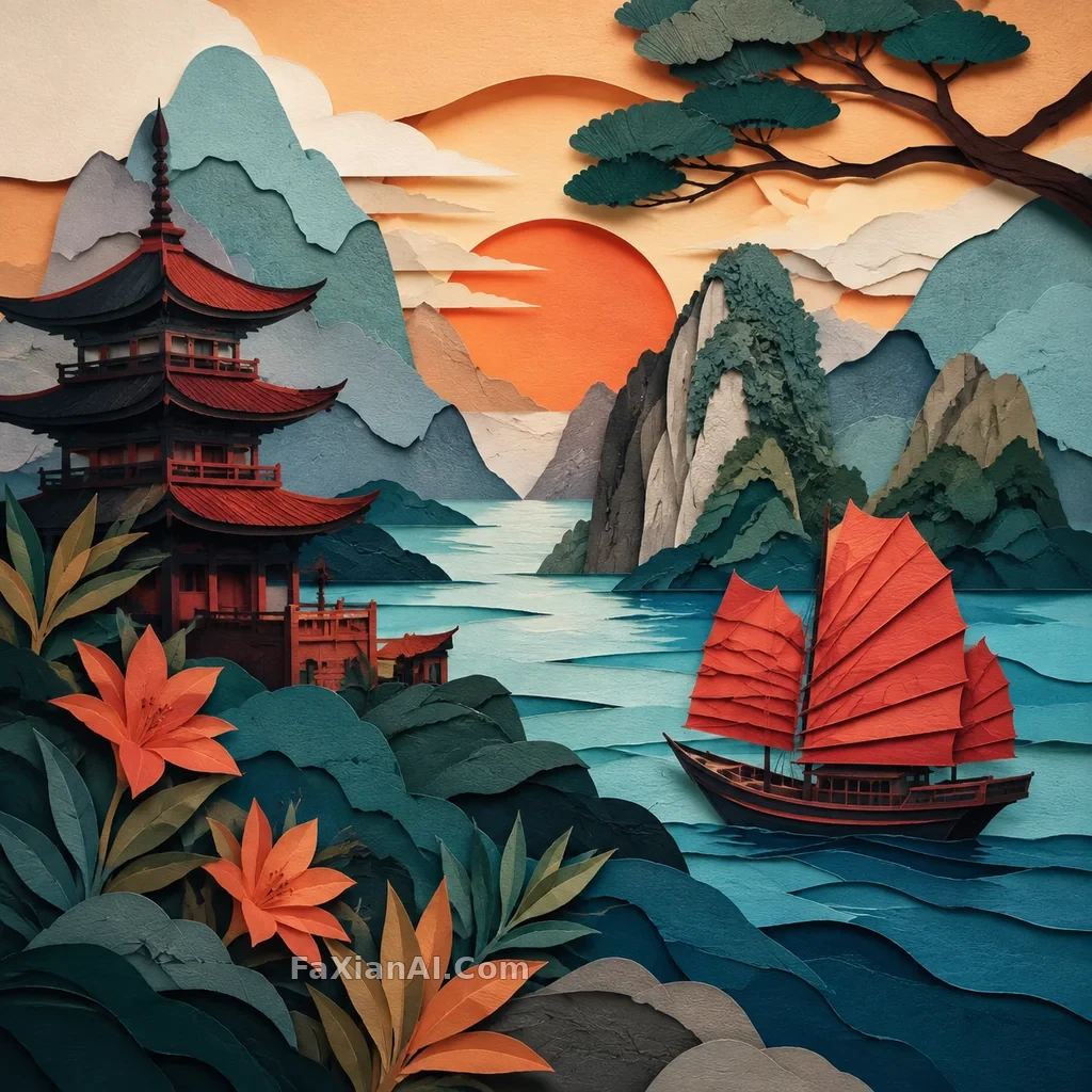
Continuing the New Chinese solar-term, zero-gravity snapshot, and papercut travel-poster series: a papercut travel poster shifted from cluttered high saturation to a unified warm-cool hierarchy, with clearer paper edges, shadows, and dominant colors.
✍️ Recreated based on three reference styles the user provided; before publishing, a clear image must be independently generated, compressed to WebP, backed up, built, and verified publicly.
📋 Prompt Natural Language
Generate a square, high-resolution finished image: a papercut travel poster shifted from cluttered high saturation to a unified warm-cool hierarchy, with clearer paper edges, shadows, and dominant colors. The image should look like a hero shot from an Imagefx case study page — clear subject, strong sense of a captured moment, crisp detail, believable lighting. No text, letters, numbers, logos, watermarks, readable signage, fake UI, low-resolution blur, collage, borders, or multi-image grids.