
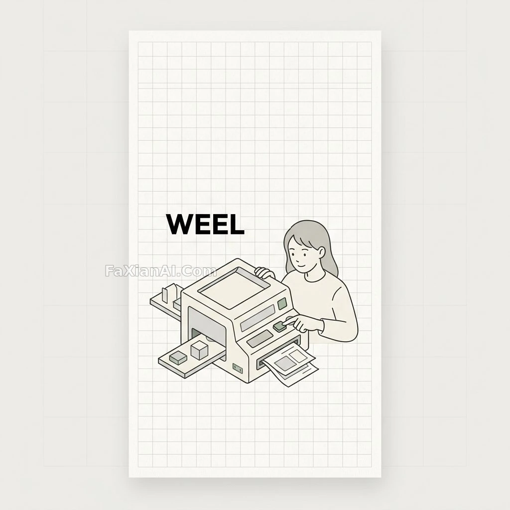
A Minimalist Little Machine on Grid Paper
That off-white paper-grain background echoes the warm tone of expired Fujifilm, and the sage-green accents are dosed just right
✍️ The figure must have an actual operating motion with the machine — pressing a button, fitting a part — not just posing beside it. That sense of interaction is exactly what separates this from a plain infographic illustration.
📋 Prompt Natural Language2805 characters
A vertical 9:16 phone wallpaper in a Japanese minimalist editorial aesthetic: quiet and restrained, inspired by modern notebook grid design and clean infographic illustration.
The base color is a warm off-white paper texture, the whole canvas overlaid with a fine, light-gray grid, the paper feel naturally soft, bright without being harsh, the style elegant and minimal.
Composition deliberately leaves sparse whitespace, giving the phone wallpaper plenty of breathing room; asymmetric balance, with the main illustration sitting slightly below center, while the top and upper-middle areas stay open and calm. Only [subject: a young woman] appears in the frame, overall tone warm and friendly — she needs to be clearly integrated with the machine at the center of the frame and actively operating it, her demeanor refined, mature, and put-together.
The illustration's centerpiece is a machine / creative device / abstract workflow object rendered in minimalist isometric line art: outlines drawn in dark gray to near-black, interior filled with soft cream and light gray, accented with soft [accent color: sage green] details, a few small geometric shapes or paper-like modules flowing out of the device. This single young woman is the only figure, naturally positioned around the central object, engaged in an intimate, affectionate interaction with the machine — her state should be friendly, relaxed, focused; no other adult appears besides her, and she must be clearly operating the machine, such as pressing or adjusting its control panel and buttons with her hand while catching a paper-like module the machine ejects, her hand and pose showing a clear connection to the machine so the interaction reads as intentional and functional; the machine and the woman should feel like one unified scene rather than two separate elements. The overall illustration should convey an intelligent, stylish, poetic quality rather than an industrial-technical one, following a high-end Japanese design sensibility — clean, tidy, refined.
The typography keeps only one very short English phrase, "[text: WEEL]", set in a bold modern sans-serif, in clean black, medium size without standing out too much, alignment crisp with generous spacing, so the text reads as part of the design itself rather than a poster-style headline.
Palette limited to off-white, soft gray, black, and soft sage green, low saturation, contrast handled elegantly, avoiding harsh neon colors.
Overall style direction: minimalist, high-end, calm, intelligent, strongly editorial, Japanese taste, beautiful negative space, clean geometric shapes, a subtle stationery-like quality, slightly futuristic yet still warm, a stylish wallpaper suited for adult use.
Output quality: extremely clean composition, high clarity, fine intricate detail.
Related Cases
 A First-Person Ride Down a Desert Highway
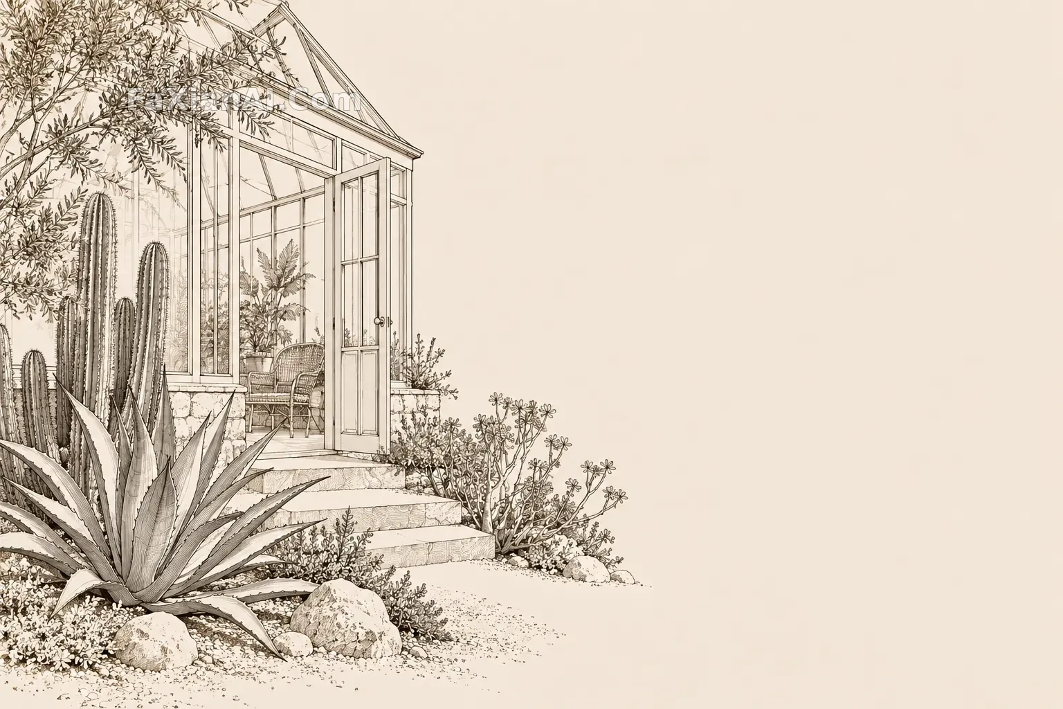 Line drawing wallpaper of desert botanical garden
 The Jellyfish Glowing Alone in the Deep
 Half a Panda Face Peeking Through Bamboo Shadow
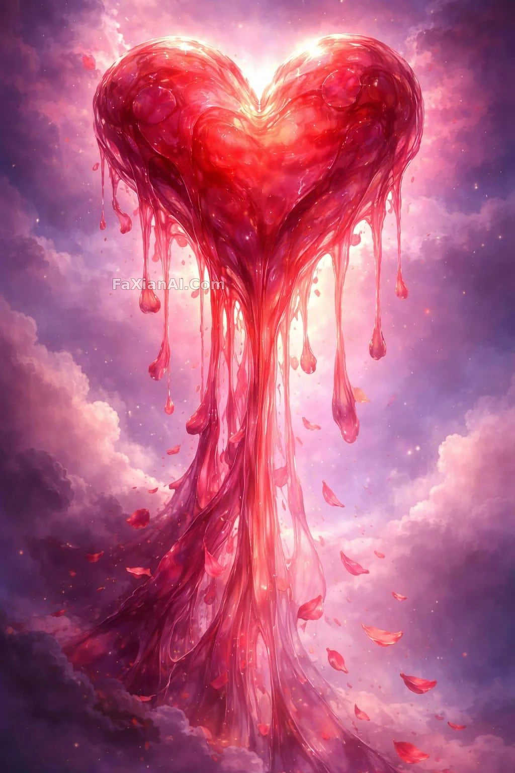 This Heart Is Melting, and It's a Perfect Fit for Today's Wallpaper
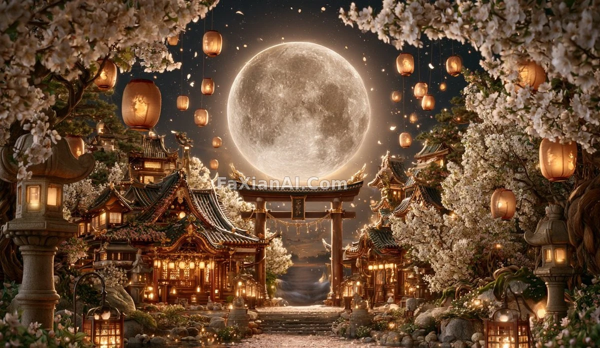 A Shrine Under Falling Cherry Blossoms and a Full Moon Torii