Home › Creative Ideas › One Poster Tears Kyoto's Century-Wide Time Gap
One Poster Tears Kyoto's Century-Wide Time Gap
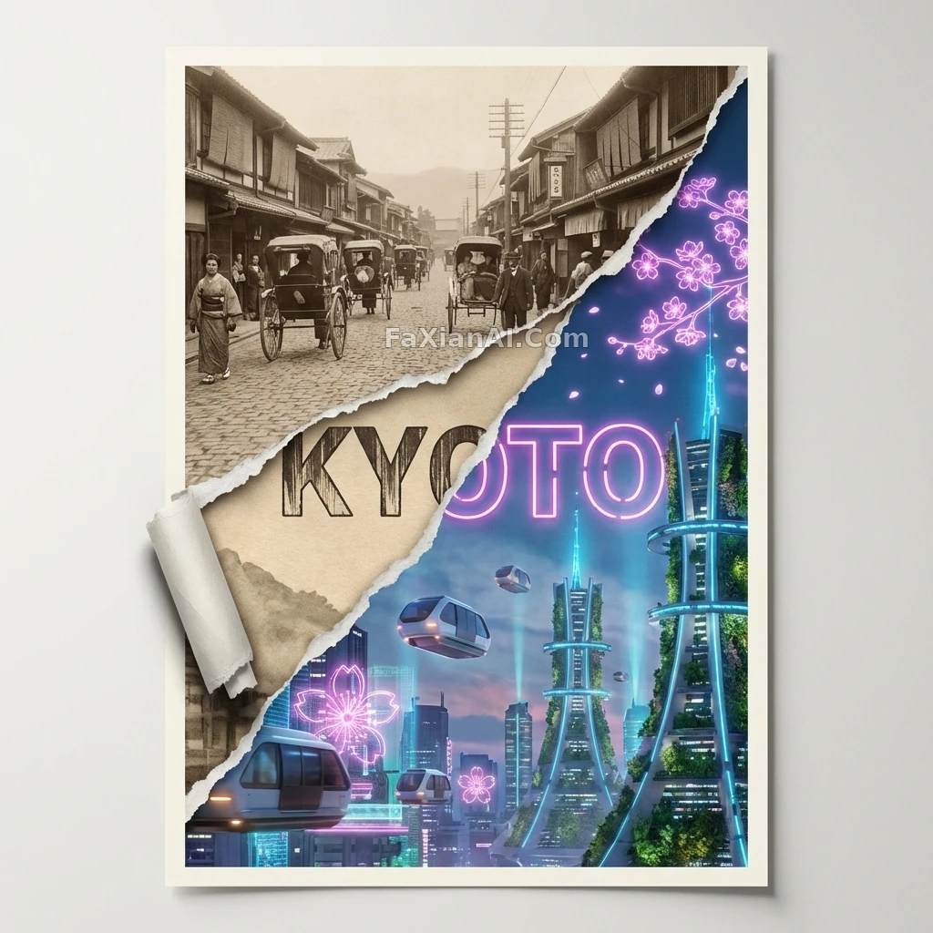
A diagonal tear splits the frame in two — a retro rickshaw on one side, a hovering transit pod on the other, the kind of contrast that still holds up zoomed all the way in.
✍️ That torn diagonal line is the click-bait hook — two eras talking across a ragged edge, with the typeface switching styles right along with them. That contrast beats going purely retro or purely sci-fi.
📋 Prompt Natural Language693 characters
A 2:3 poster, the frame ripped apart along a brutal diagonal tear: the upper-left corner falls into 1920s Kyoto — sepia-toned old streets, rickshaws, machiya eaves; the lower-right reveals a future Kyoto in 2080, hovering transit pods drifting past holographic cherry-blossom ads, a cyber-Shinto tower overgrown with vertical gardens. The torn paper edge keeps a tactile quality, curling slightly and casting a shadow. The word KYOTO spans both eras, its typeface switching too: retro woodblock-print style on the left, neon sci-fi kanji-inspired lettering on the right. Soft studio-style lighting, a cream-colored border framing the whole piece, resolution high enough for print-ready output.