Home › Style Transfer › A Wide Vista Toned in Blue and Orange
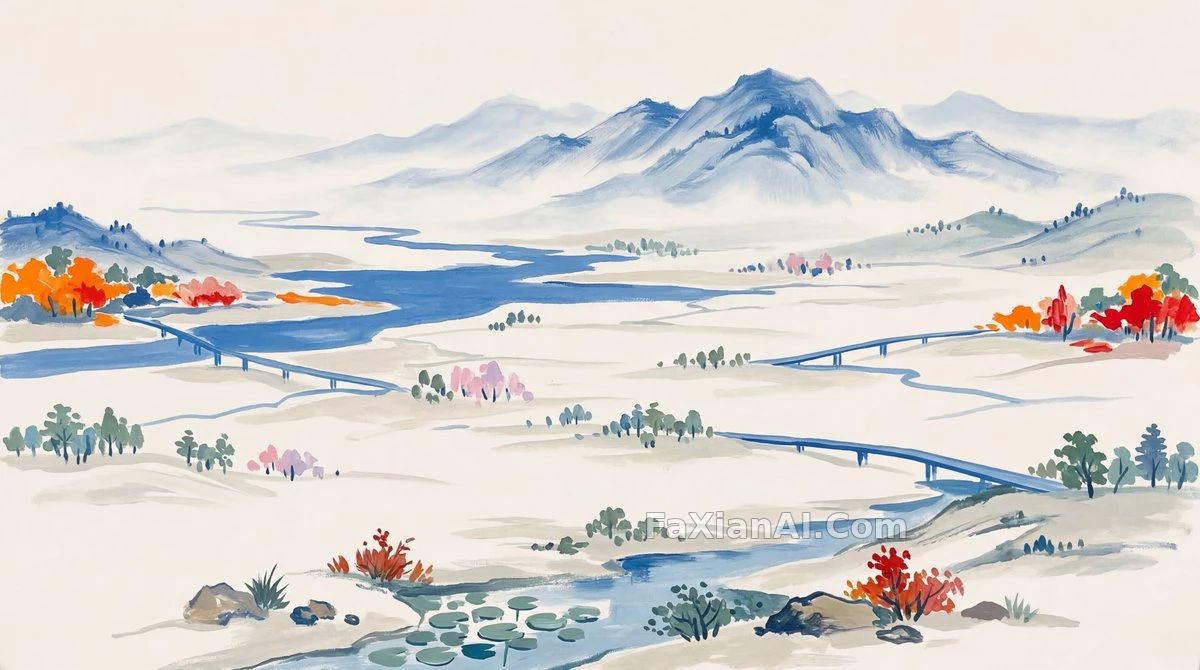
A Wide Vista Toned in Blue and Orange
The structure here stays clean — the main color sets the tone while orange only accents it, the balance handled with real restraint.
✍️ Writing the palette first is like setting the essay's thesis before anything else — the orange is just the pivot sentence that makes the point; use too much of it and the whole thing goes off-topic, with the landscape itself becoming mere illustration.
📋 Prompt Natural Language
A landscape painting with a distant, evocative mood, the main viewpoint aimed at the vast, faraway horizon: the entire frame's base tone is locked to [main background color: #f6f4f0], while the blue shared between sky and water is unified under [main blue color: #2d6dc3], with a few scattered strokes of orange dotted at the corners of the frame to inject a touch of warmth into the cool palette. The horizon is set low, leaving the sky plenty of room to breathe.