Home › Design Assets › Brand Guidelines Laid Out in a 3x3 Grid
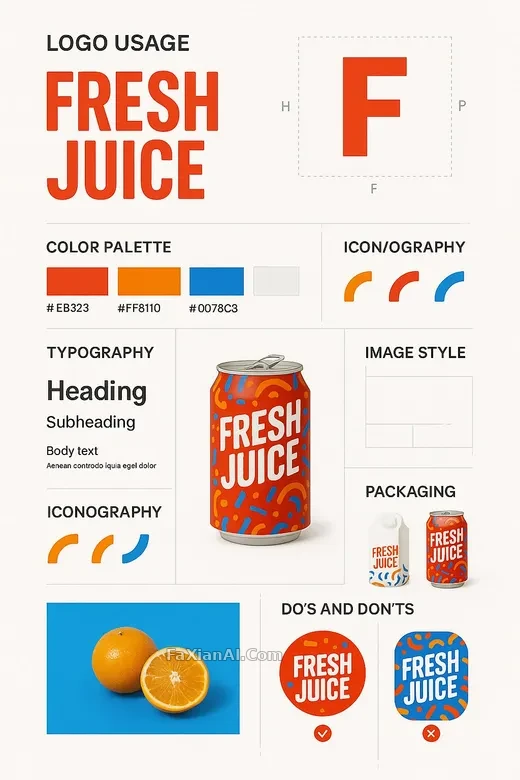
Brand Guidelines Laid Out in a 3x3 Grid
From clear-space rules to line-spacing specs, nine modules lay bare the skeleton of a full type system.
✍️ The module that matters most in this grid is the last one — the do's-and-don'ts comparison. A guideline poster only earns its credibility with a real counterexample; without it, the first eight modules are just nice-looking layout.
📋 Prompt Natural Language848 characters
A vertical 9:16 brand guidelines poster, built from the uploaded product image, with the overall visual identity tied directly to the product's own design system. The layout sits on a minimal white or soft neutral background, with structured dividers and drop shadows creating hierarchy — finished enough to use directly in a print or digital brand book.
Nine modules are laid out cleanly, without crowding: a large logo showcase with clear-space rules; a centered, prominent product mockup; a primary and secondary color palette with hex codes; a typography guide covering headline, subhead, body samples and line-spacing rules; examples of brand-specific icons or patterns; lifestyle or studio-style image-treatment samples; a grid system and layout rules; packaging mockups and surface applications; and an annotated do's-and-don'ts comparison.