
Let Materials Speak: Prompts for Glass, Metal and Stitches

“Premium texture, exquisite detail, soft light” fits many prompts but rarely explains why an image works. A highlight may reveal glass thickness yet make thread look like plastic. Start not with how luxurious the picture should feel, but with how the object receives light, which traces must stay visible, and which areas should remain quiet.
These examples are independently generated and reviewed concept images, not photographs of physical products or craft inspection reports. A prompt communicates visual intent; it does not establish material, dimensions or manufacturing feasibility. For the basic structure, see the prompt-writing formula.
Transparency: let edges, interiors and the table agree
The glass and yellow pears pair a similar outline with different materials. Real fruit retains opaque yellow skin; bubbles, slight asymmetry and table caustics explain the glass pear's thickness. The comparison is a visual ruler, not spare decoration. If both resemble polished plastic, the material task is unfinished.
Try this focused exercise: “Pale aqua blown-glass pear, a few internal bubbles, a tall narrow softbox on the right, restrained caustics on the table; the yellow pear beside it keeps opaque fruit skin.” Don't add strong backlight, all-direction soft light and multicolored neon together. Choose one key light and inspect edge separation. Browse more glass-texture examples for comparison.
Metal: organized reflections, not maximum brightness
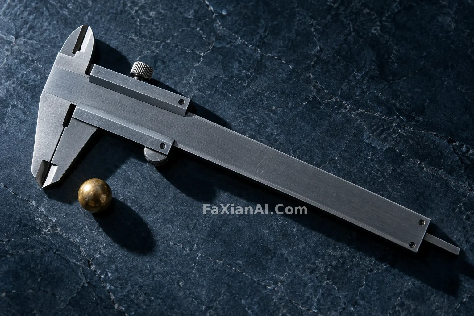
The cold-lit caliper uses a blue ground, clear shadow and modest machining traces for hard edges. Copper against linen places warm metal beside soft fabric to give the still life warmth. Neither needs every surface to turn white. Broad merged highlights can erase the form.
Keep the object and camera fixed, change only “cool hard light” to “soft side-window light,” then compare edges, contact shadows and reflected surroundings. The caliper is a visual concept, not evidence of precision from generated scales. For a real product, provide an authorized reference and inspect its features individually rather than relying on adjectives.
Fibers: specify direction and thickness, not just roughness
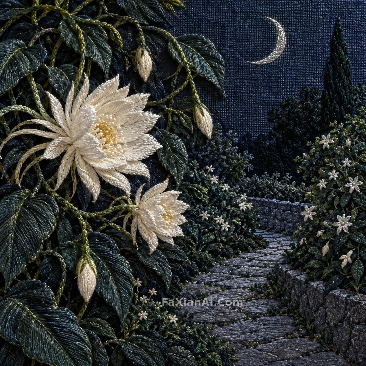
The embroidered moon garden gives petals dense satin stitches and stems fine chain stitches, then uses raking light to reveal their height above linen. That is more testable than “rich texture, extreme detail”: do stems and petals use different threads, is the ground cloth visible, and have highlights erased thread direction?
Embroidery, patchwork and needle felt all express textiles, but should not share a generic noise layer. For felt, inspect short fibers and round contours; for quilting, inspect seams and batting depth. Material names should match making traces. Don't invent knitted loops merely to cover a tag.
Change one thing, then inspect the delivered file
Choose a subject and hold composition, color and camera steady. Try light-source width, angle or background brightness separately. Keep the original prompt and generated image for each change so you can tell what caused it. Inspect the exported file too: compression can erase paper fibers, fine stitches and metal scratches while leaving the broad silhouette apparently intact.
This method suits material mood boards, craft-style exploration and product-visual exercises, not product photography, dimensioned drawings or manufacturing validation. The most useful prompt is not the longest list of adjectives. It is the one whose result lets you say exactly what worked and what needs another pass.